How to Design a QR Code: Best Practices, Mistakes to Avoid, and Real Examples
Learn how to design a QR Code that reflects your brand. Create a beautiful QR Code that follows design best practices to ensure scannability is not compromised.
Custom QR Code design is now a standard part of how serious brands show up in print and packaging. The color, the logo placement, the eye shape, the frame, the call-to-action: every one of these is a design decision with a right and a wrong answer, and getting them wrong does not just look bad. It breaks the scan entirely.
This guide covers every visual layer of a QR Code you can design, the rules that keep a customized code scannable, the mistakes that silently kill scan rates, and real brand examples that show what good QR Code design actually looks like in practice. Whether you are designing your first branded QR Code or auditing an existing one, this is the reference to work from.
What aspects of a QR Code can you design?
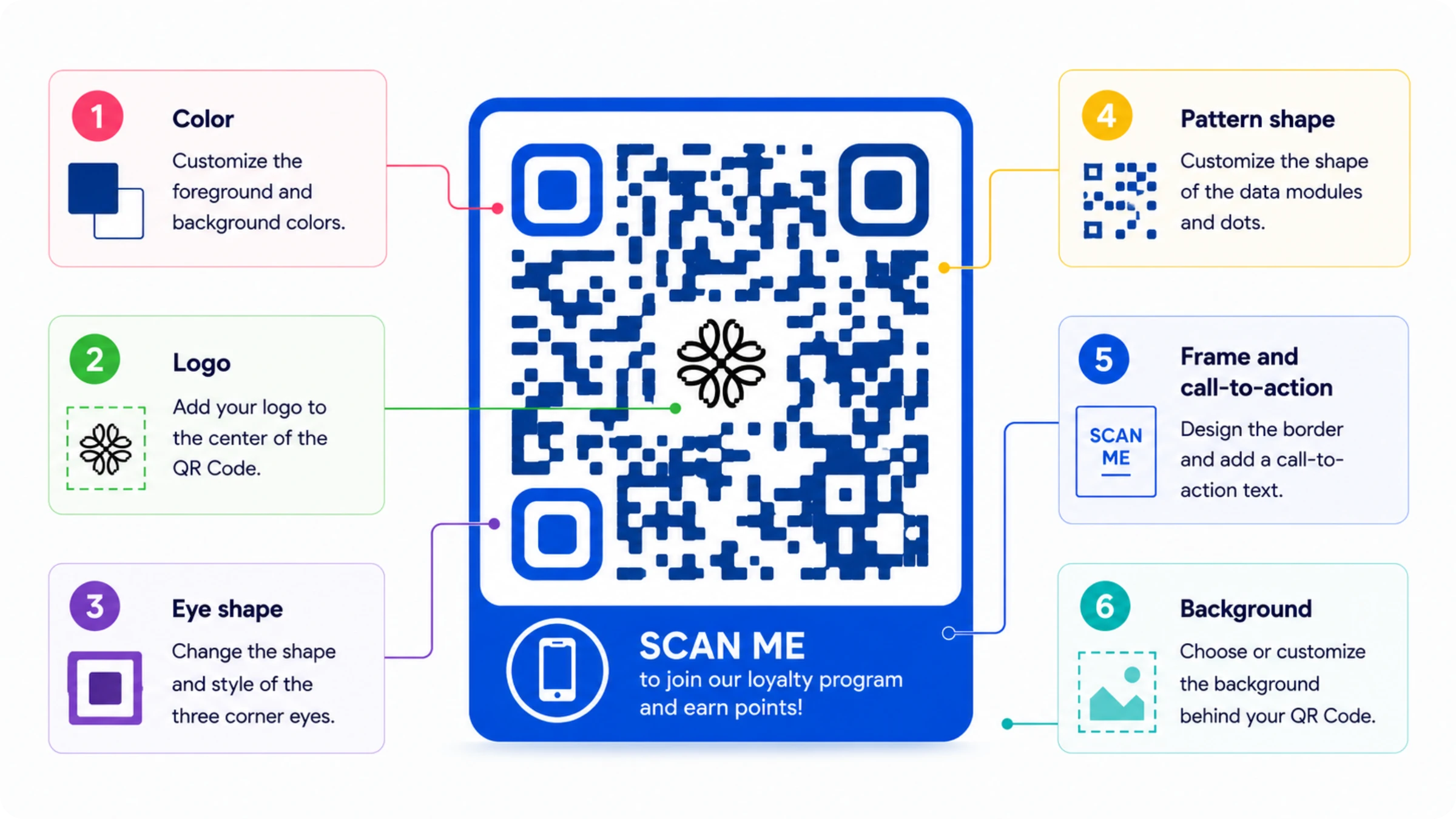
A QR Code is not locked into black squares on white. Once the data grid is generated, these visual layers can change without affecting how it reads:
- Color: foreground and background, as long as contrast stays scan-safe
- Logo: a logo at the center of the QR Code error-correction budget
- Eye shape: the three corner squares, reshaped within scanner-recognizable limits
- Pattern shape: the smaller data modules, styled as dots or rounded squares
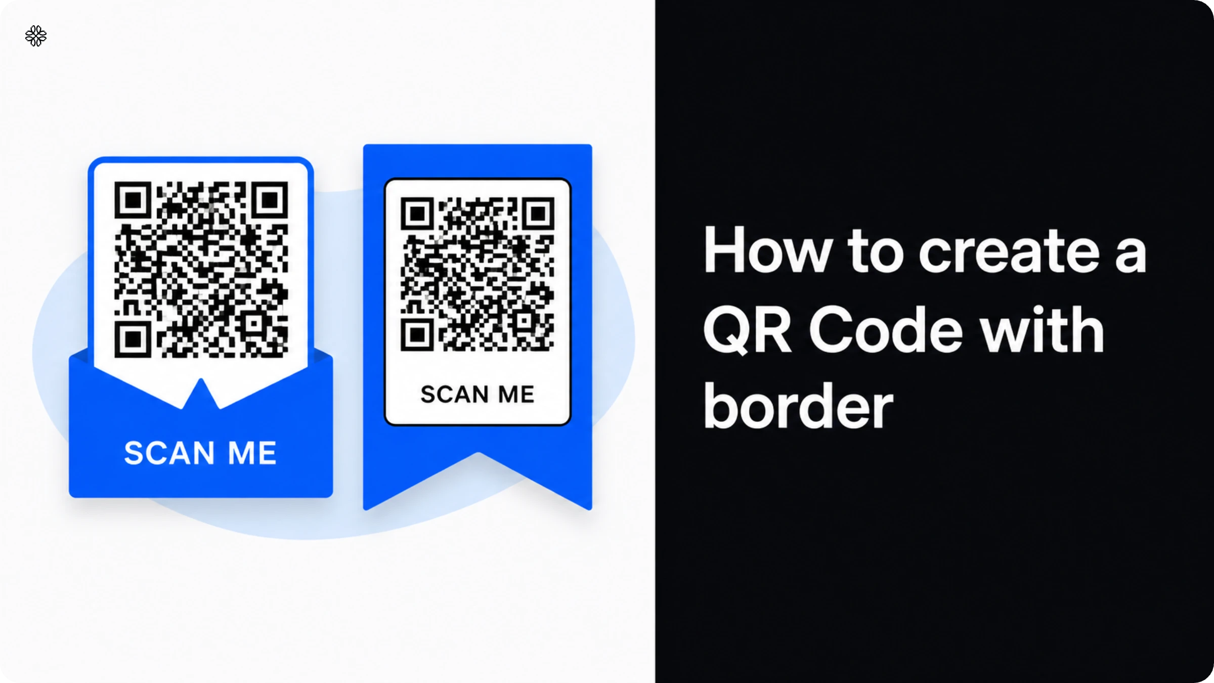
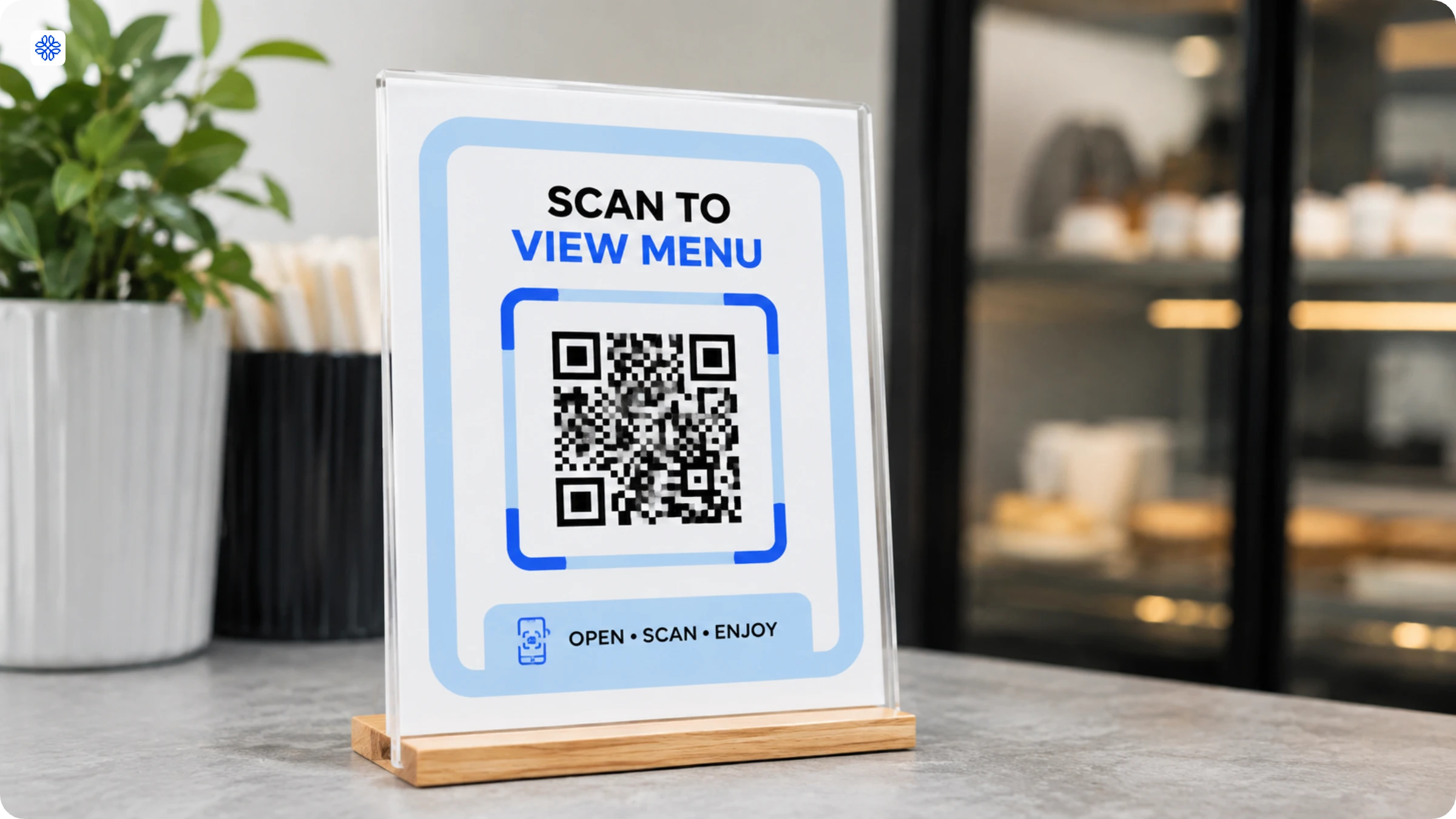
- Frame and call-to-action: a call-to-action border around the QR Code with text like "Scan to order"
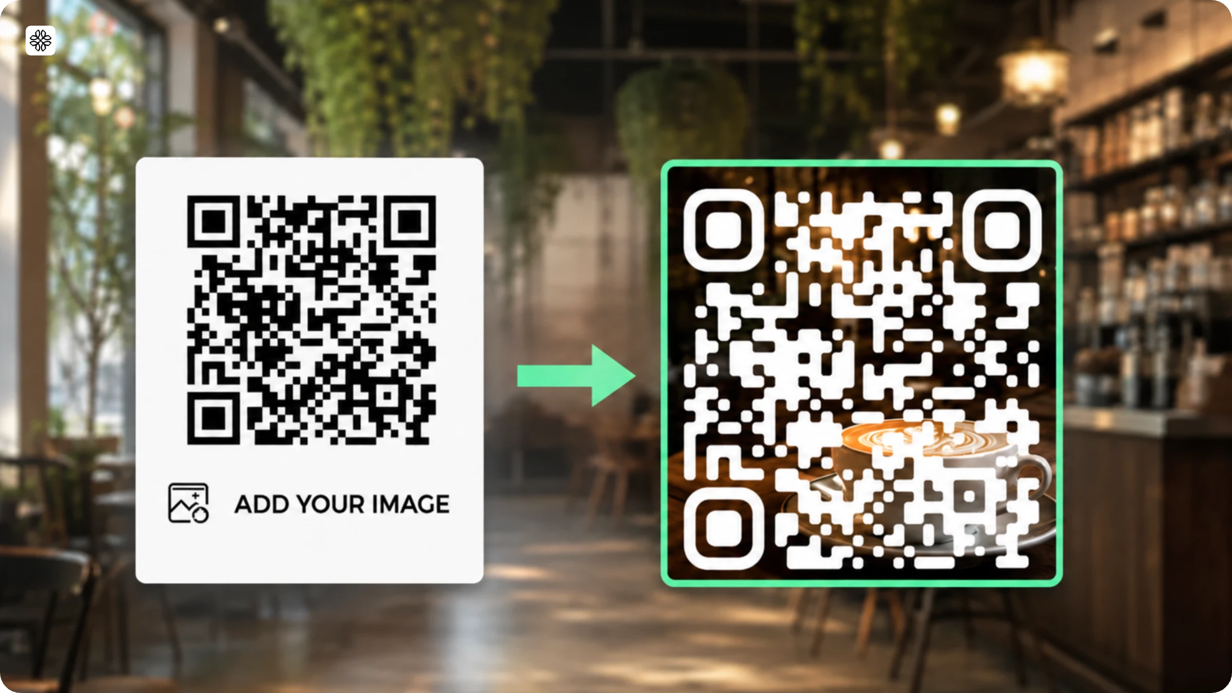
- Background: an image behind the QR Code, kept clear of the quiet zone
Why should you customise your QR Code?
Customizing a QR Code will help increase trust and also differentiate your brand.
- Signals legitimacy: branding reads as safer than an anonymous grid of squares
- Reinforces brand recall: matching the color and logo already on nearby packaging or signage
- Improves scan intent: a CTA frame gives people a reason to scan, not just notice
- Differentiates from competitors: a branded QR Code stands out among generic ones
How to make sure your designed QR Code is scannable
While designing a QR Code, you need to make sure that it remains scannable. Poor color contrast between the foreground and background can make it difficult for scanners to distinguish the modules, especially when light colors are used on white or similarly light backgrounds.
- Keep contrast at or above 40% between foreground and background. Pastel-on-pastel and gradient-on-gradient combinations are the most common way this rule gets broken, and below that threshold a scanner's camera cannot distinguish the data modules from the background.
- Set the error-correction level before you customize. Every QR Code carries a correction level (L, M, Q, or H) that determines how much of the QR Code can be obscured or damaged and still scan. Raise it before adding a logo or reshaping the pattern, not after a design fails testing.
- Leave the quiet zone clear. The blank margin around the QR Code is what scanners use to locate its edges before decoding the data inside. Text, borders, or a background image that bleeds into that margin causes the same failure as low contrast: the scanner cannot find where the QR Code starts.
- Limit how far eye and pattern shapes stray from the expected form. The three corner squares and the smaller data modules can be rounded, dotted, or reshaped, but push either too far and recognition drops before the underlying data is even evaluated.
These four rules interact rather than operate independently. A lower error-correction level narrows how much contrast, margin, or shape distortion the QR Code can tolerate before it stops working. Treat them as one system to design within, not four separate settings to tune in isolation.
10 best practices for QR Codes people actually scan
The rules above explain why a customization choice can break a scan. These are the practices that put those rules into action for every QR Code you ship, from a single test print to a packaging run of thousands.
1. Keep the contrast scan safe
Always keep the foreground darker than the background, never invert this, as most scanners are optimized to read dark modules on a light surface. A good rule of thumb is to maintain at least a 4:1 contrast ratio between the module color and the background. With Uniqode, you can check scannability in real time as you design, so you always know if your contrast is holding up.
2. Don't let your logo break the scan
Keep the logo or brand mark at the center within 30% of the total QR Code area to stay within the error correction limit. If your logo has a lot of detail or thin lines, consider simplifying it so it reads clearly at a small size. Uniqode flags scannability issues in real time, so you can resize and adjust your logo with confidence before publishing.
3. Keep the background simple
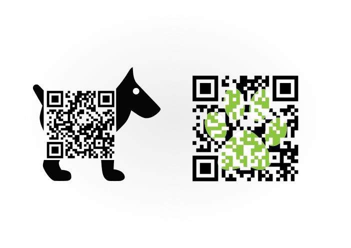
If you are adding a background image, keep it subtle. Busy or high-contrast images behind the modules can interfere with scanning, even if the quiet zone is clear. Choose images that are soft, low in detail, and well faded so the modules remain the most visually dominant element. Uniqode lets you preview and test scannability in real time as you layer in your background, so nothing goes live until it is scan-ready.
4. Skip the gradient colors if possible
Stick to solid colors for the modules rather than gradients or patterns that fade, as inconsistent fill can confuse scanners at the module edge. If you want to add a gradient effect to your QR Code, apply it to the background or the frame instead, where it will not interfere with how scanners read the modules. Uniqode's real time scannability check will immediately flag any fill choices that could cause a scan to fail.
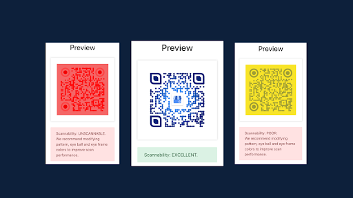
5. Get contrast and error correction right before anything else
Keep contrast at or above 40% between foreground and background, and set the error-correction level before you start customizing rather than after a design fails. These two settings are the foundation everything else in this list depends on: a higher correction level buys room for a logo or reshaped pattern, and enough contrast keeps the scanner able to find the data in the first place.
6. Leave the quiet zone clear
The blank margin around a QR Code is not empty space to fill with a logo, text, or a background image. Scanners use it to find the QR Code's edges before reading anything inside. Crowding it, even with something as small as a caption line tucked too close to the border, causes the same failure as low contrast: the scanner can't locate where the QR Code starts.
7. Keep logo and shape customization within scanner limits
Center a single logo rather than layering multiple brand marks, since more elements compete for the same error-correction budget. The same discipline applies to eye and pattern reshaping: the three corner squares and the data modules can be rounded, dotted, or restyled, but only as long as the scanner still recognizes the underlying square structure. Push either too far and recognition drops before the data itself is even evaluated.
8. Add a frame with a specific call-to-action
A frame with a bare QR Code and no context gives a scanner no reason to bother. "Scan for the menu" or "Scan to save 15%" turns a mystery square into an instruction, and QR Codes with a clear CTA consistently outperform bare ones.
9. Test the printed proof on more than one phone
A QR Code that renders fine in design software can still fail on an actual phone camera in actual lighting. Test the printed proof on at least two different phone models before the full run ships; this single step catches most late-stage failures that a screen preview never reveals.
10. Match print size to scan distance
Print your QR Codes at a minimum size of roughly 2x2 centimeters (about 0.8 inches) for close-range scanning, such as a business card or a table tent. Scale up substantially for distance scanning, like a billboard, a storefront window, or an event banner, where the QR Code needs to hold its resolution from several meters away.
11. Design for the surface, not just the flat mockup
Curved and reflective surfaces distort a QR Code's geometry in ways a flat design mockup never shows. A QR Code printed on a coffee cup, a bottle, or a glass panel bends or glares in ways that break a scanner's ability to read the grid, and needs extra margin and contrast built in to survive that.
12. Use a dynamic QR Code and let design tools handle the guardrails
Use a dynamic QR Code for anything with a destination or design that has any real chance of changing later. Most QR platforms, including Uniqode's, let you set a scan-safe error-correction floor before you touch color or logo placement, so the design pass never drifts past what the QR Code can survive. Auto Design tools, where available, generate a first pass of on-brand variations automatically instead of starting from a blank canvas.
Treat this list as a checklist to run before a QR Code goes to print, not a set of ideas to sample from. Skipping any single item rarely breaks a design on its own, but the failures in the previous section almost always trace back to one of these eight practices being skipped.
QR Code design mistakes to avoid
More than a third of consumers say they've encountered a QR Code that simply didn't scan properly, according to Uniqode's State of QR Codes 2026 report. Most of those failures trace back to a small set of avoidable design choices.
- Oversized logos that cover more of the QR Code than the error-correction level can absorb, turning a working design into a broken one, a failure that surfaces only after it's already printed.
- Low-contrast or gradient backgrounds that look sharper on a screen than they scan on a phone camera under real lighting
- Skipping a live-device test before print, since a QR Code that renders fine in design software can still fail on an actual phone camera in actual lighting
- Placing QR Codes on curved or reflective surfaces, such as a coffee cup, bottle, or glass panel, without extra margin and contrast to survive the distortion
- No frame or call-to-action, leaving a scanner no reason to bother with what looks like a mystery square
Each of these is fixable before print, not after. A contrast check, a printed proof scanned on two phones, and a CTA frame catch nearly every failure mode on this list before it costs a reprint.
How to design your own QR Code on Uniqode
Uniqode's QR Code generator applies these same principles in order, so design decisions happen in the sequence that keeps a QR Code scannable.
1. Choose your QR Code type
Pick what the QR Code should do: link to a website, a Linkpage, a form, or another destination. The type sets what options appear next.
2. Customise the color and patterns
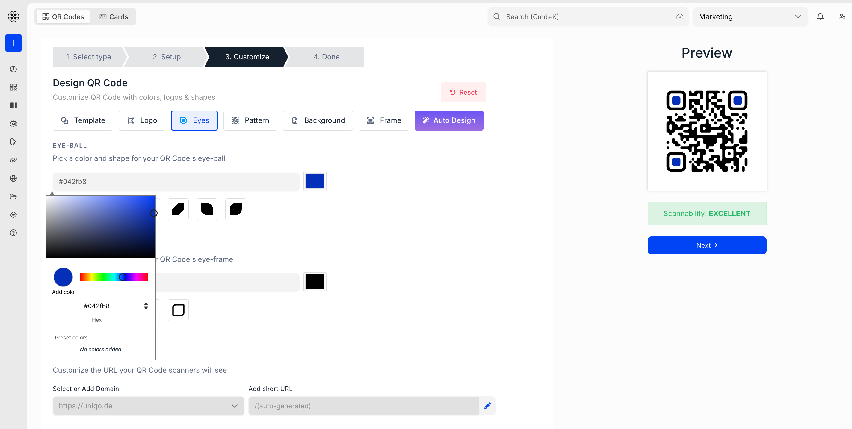
Change the colors of the patterns and eyes. You can also change the pattern of the QR Code.
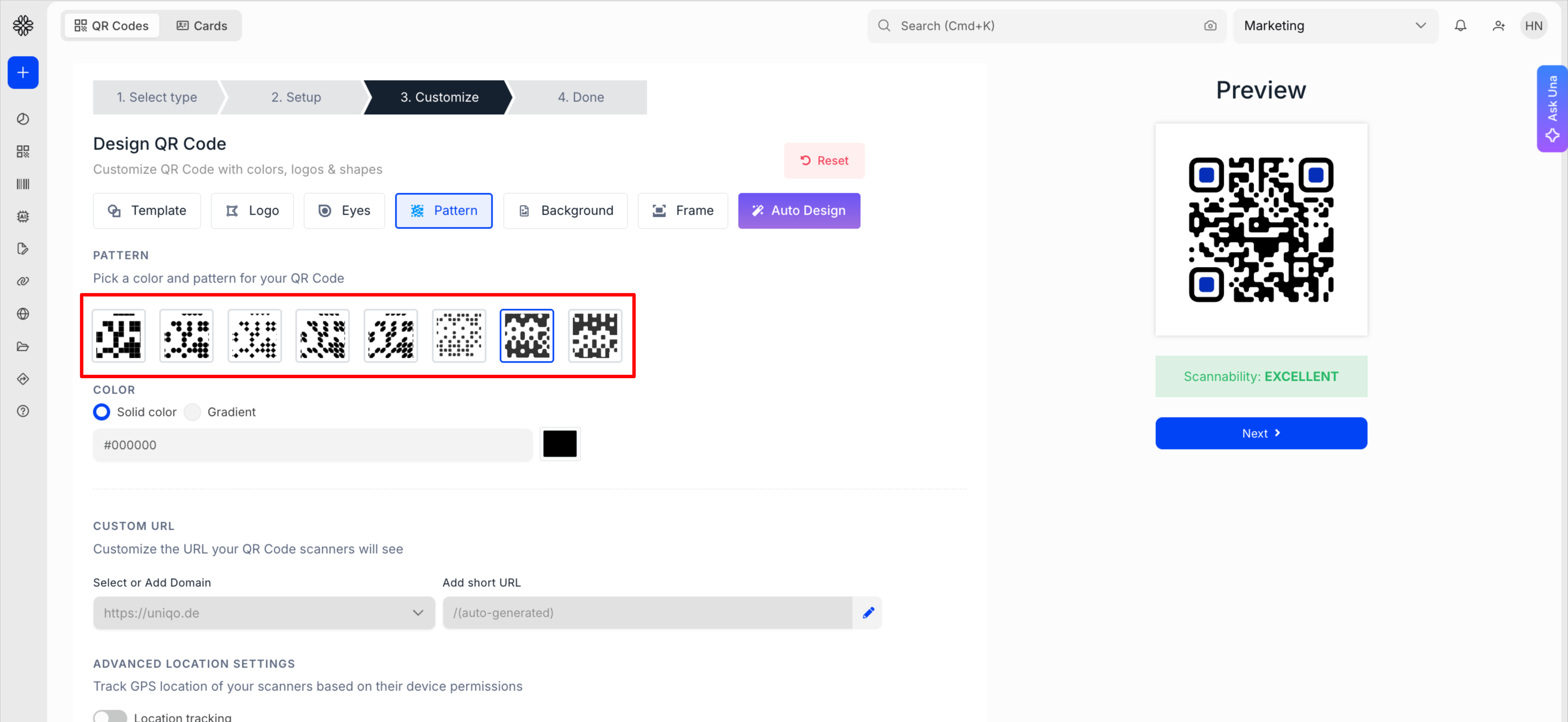
You can also add a background color or image. If you want a transparent QR Code, choose the Transparent from the background tab.
3. Add a logo
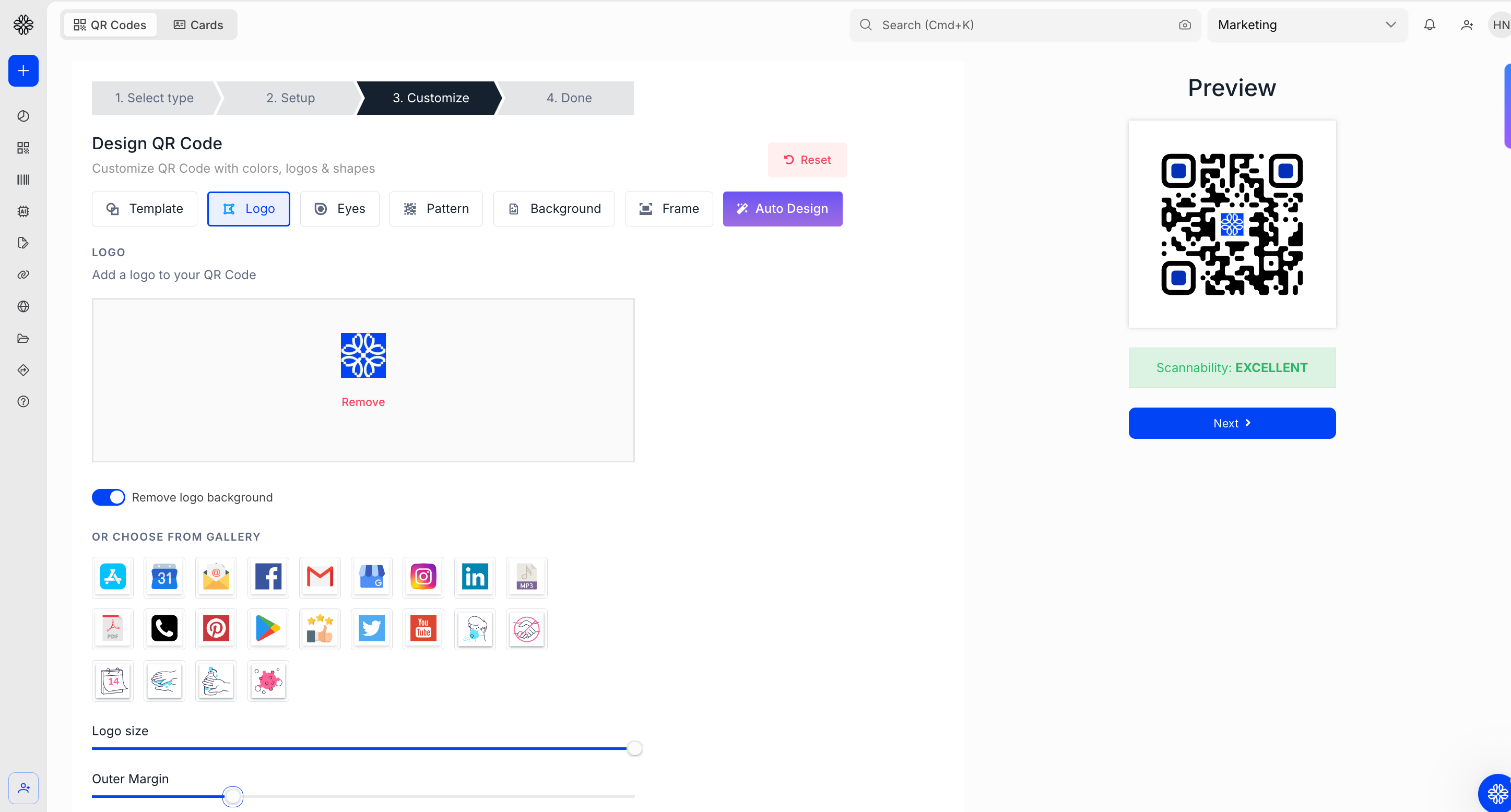
Upload a logo in the middle. Auto Design can generate a first pass of on-brand variations automatically instead of starting from a blank canvas.
4. Add a frame, then test
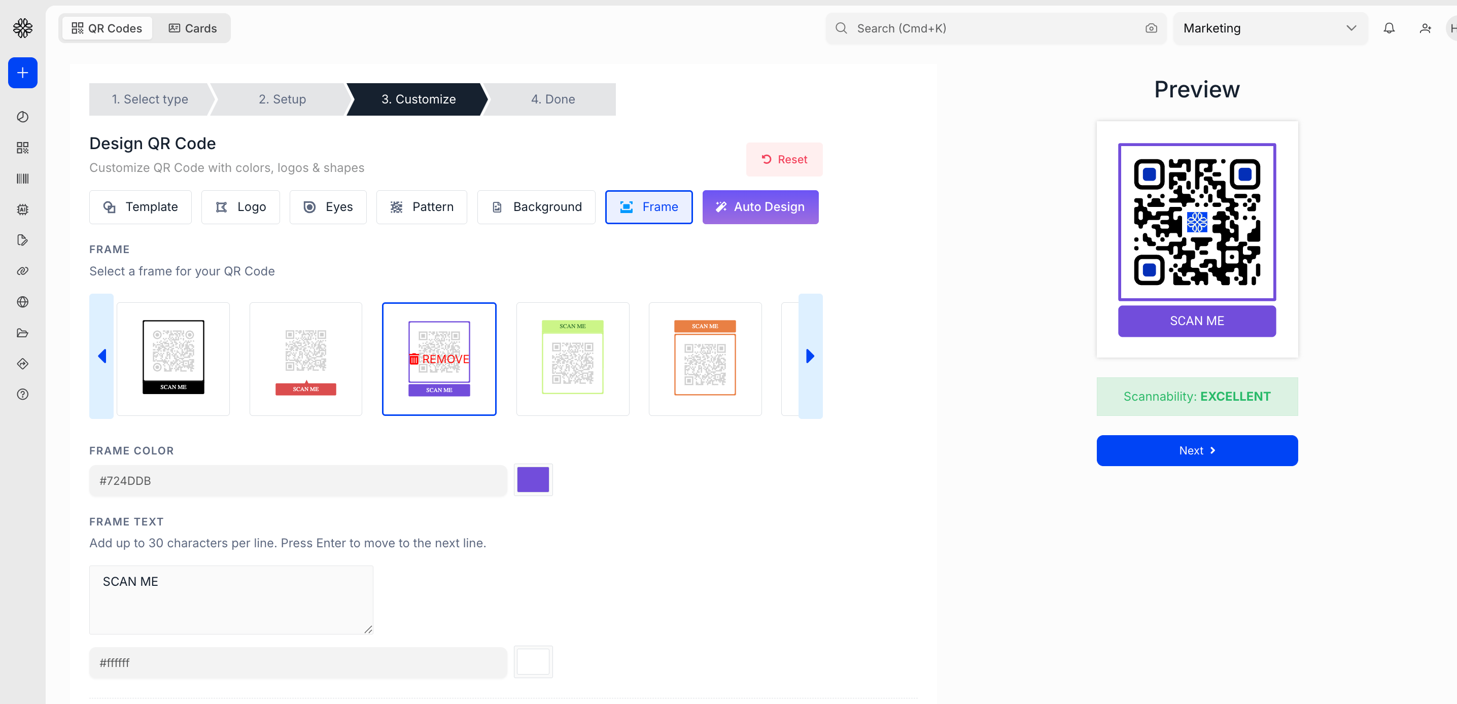
Add a frame with call-to-action text such as "Scan to order," including circular framing where that fits better than a square. Preview and test on an actual device before downloading.
Examples of branded QR Code to inspire your QR Code designs
Here are some brands that use beauitifuly designed QR Codes for their marketing campaigns.
MTV: brand design around the code, not on it
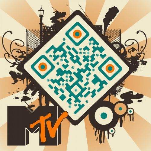
MTV kept the core module pattern clean and buildable, then wrapped the brand identity around the outside. The rotated diamond shape, the illustrated cityscape, the orange eye accents, all of it lives in the periphery. The scannable area stays untouched. This is disciplined design thinking: knowing exactly where the creative freedom ends.
Takeaway: Build your brand expression around the QR Code, not over it. The modules are sacred.
Kellogg's Froot Loops: the QR Code as part of the world
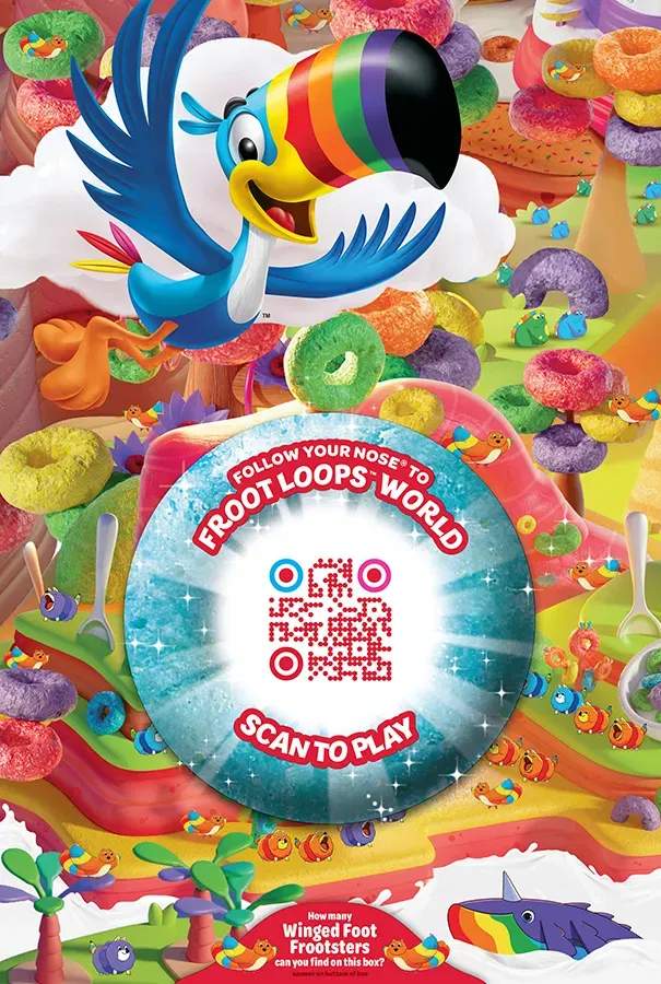
Kellogg's embedded the QR Code inside the illustrated universe of the packaging. The circular frame, the "Scan to Play" CTA, and the colorful dot-style modules all feel native to the Froot Loops world. Nothing looks bolted on. This is QR Code design at its most immersive, where the code becomes a portal that matches the destination it leads to.
Takeaway: Customize your QR Code to match the experience it unlocks, not just the brand it belongs to.
Calvin Klein: restraint as a design statement
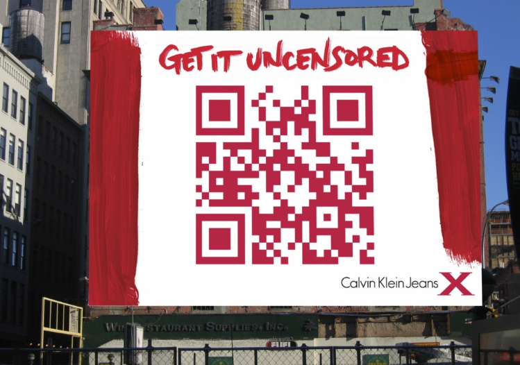
Calvin Klein used a single brand color, a clean white background, and generous quiet zone to let the QR Code fill an entire billboard. No logo clutter, no competing visual elements. The contrast is high, the scan distance is accounted for, and the CTA does the heavy lifting. This is proof that a well-designed QR Code does not need decoration to command attention.
Takeaway: Sometimes the boldest design decision is to strip everything back and let the QR Code speak for itself.
Kaha Mind: when a white QR Code works
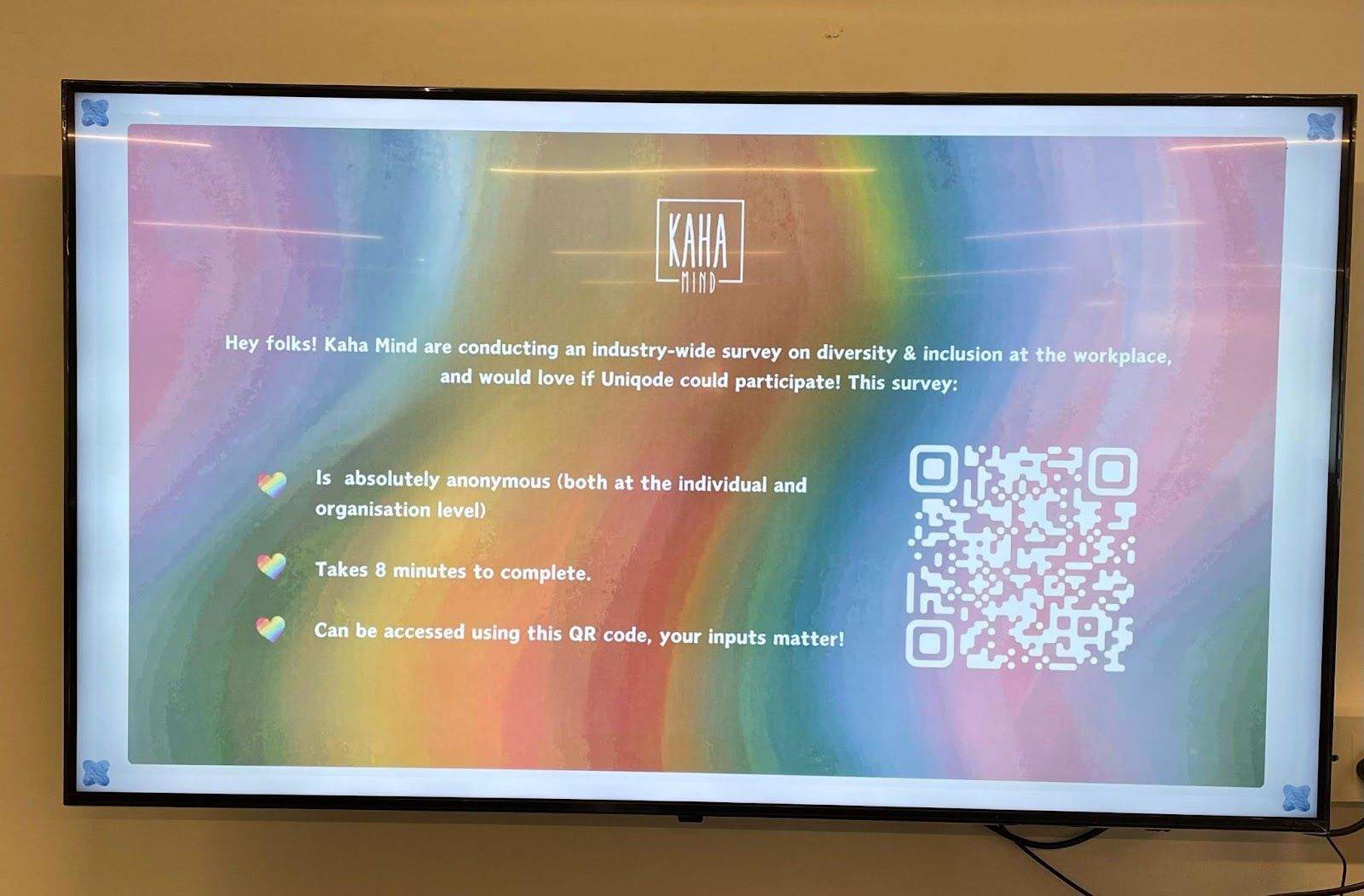
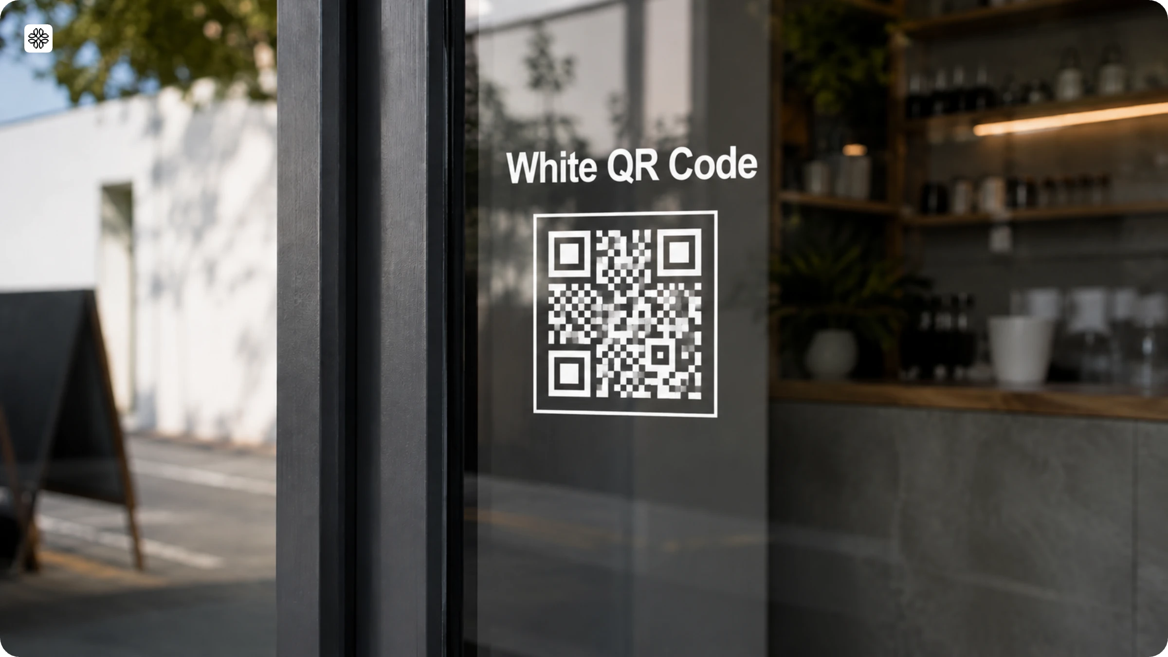
Most QR Codes default to dark on light, but Kaha Mind flips the rule deliberately. The white QR Code sits against a vibrant rainbow background, and it works because the background itself provides enough contrast to make the modules readable. The design choice feels intentional, not accidental, which is what separates a creative decision from a mistake.
A white QR Code can scan reliably as long as the background behind it is dark or saturated enough to create contrast.
Ready to design yours?
Once the principles above are the filter you're designing through, building a QR Code that follows them takes minutes, not a design review cycle. Uniqode's custom QR Code generator is the tool to use for that part: pick a type, set the error-correction floor, then apply color, logo, and frame with the contrast and quiet-zone rules already in mind. Uniqode's free trial covers the full design panel, so there's no reason to plan a custom QR Code on paper before trying it. Start designing yours on Uniqode for free and see how it scans before you commit to a print run.
Frequently Asked Questions
- How can I create a custom QR Code?
To create a custom QR Code –
- Choose a free online QR Code generator
- Pick a type of QR Code and fill in the details
- Customize the QR Code by adding a logo, changing color patterns, and even a CTA
- Generate and test the QR Code
- Download the QR Code
- Can I make my own QR Code for free?
Yes. Follow these simple step to make your own QR Code for free.
- Choose a free online QR Code generator
- Pick a type of static QR Code and fill in the details
- Customize the QR Code by adding a logo, changing color patterns, background, and even eyes.
- Generate and test the QR Code
- Download the QR Code
- Can a QR Code be of any shape?
A QR Code can be of any shape, but make sure the eyes are not misaligned, else the QR Code will be deemed unscannable. Keep in mind that extreme digression from a QR Code’s shape will make it unrecognizable and unscannable for QR Code scanners.
- Do QR Codes expire?
A static QR Code does not expire, as long as the URL linked to the static QR Code is still functioning. Else, the QR Code will not work, meaning that it will not redirect the user to a working website.
A dynamic QR Code works as long as the subscription plan is active. Post the deactivation, the QR Code will stop working.
- Can a QR Code be any color?
Absolutely. You can change your QR Code’s color scheme to match your brand, capture your audience’s attention, and improve brand recall. Colorful QR Codes help with garnering higher scan rates and enhance customer engagement.
Related Posts
High Resolution QR Code : Ensure Clarity and Scannability
Vector QR Codes Explained: SVG vs EPS, DPI, and Print-Ready Setup
QR Code with a Background Image: How to Create One That Still Scans
How to Add a QR Code Border (and Keep It Scannable)
QR Code Frames: How to Add One (Step-Wise Guide and Free Templates)