How to Create Colored QR Codes That Scan in Print and on Screen (2026 Guide)
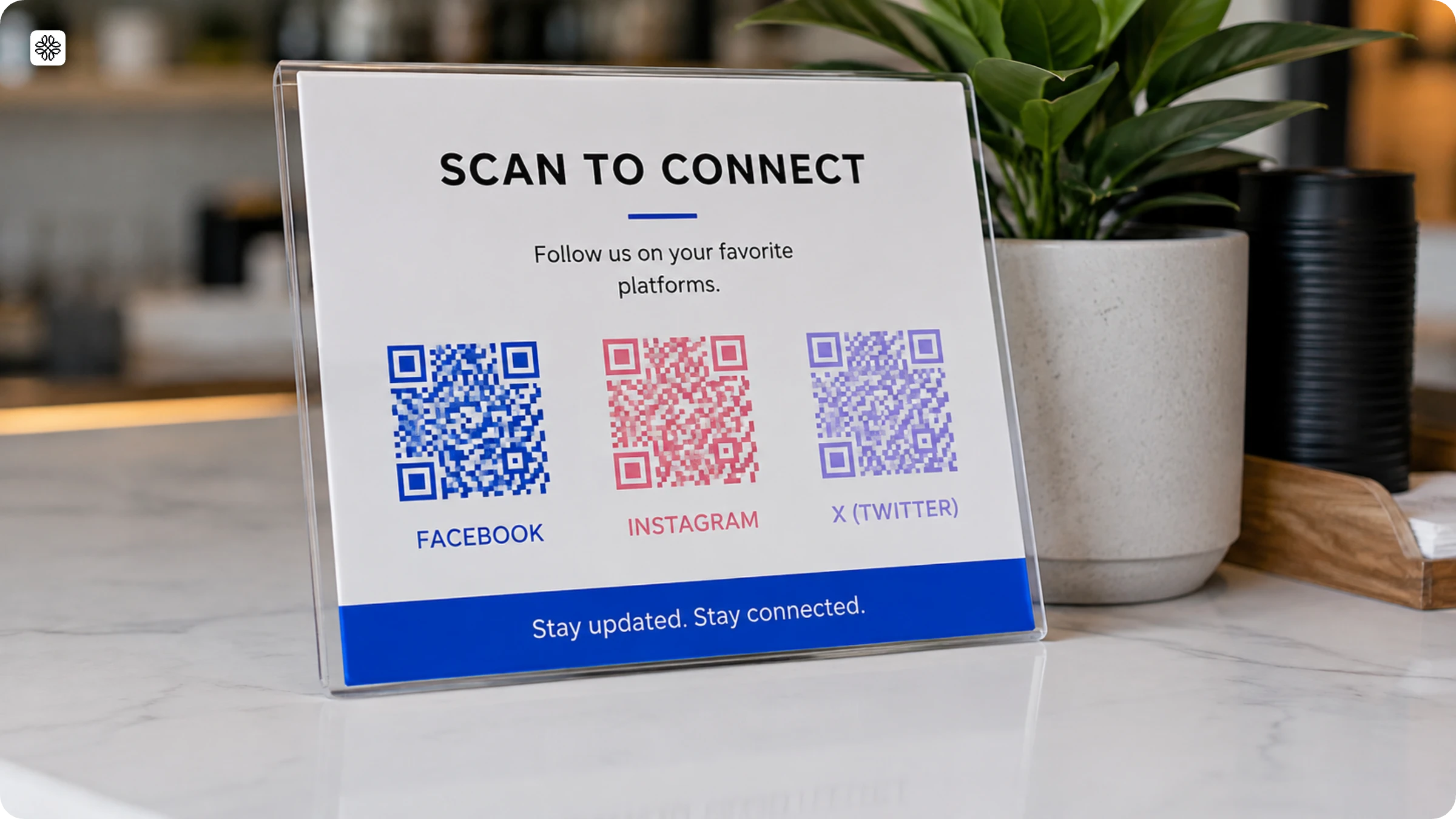
Colored QR Codes do more than break the monotony of black-and-white. They boost brand recognition and engage customers on a deeper level. In this guide, explore how color psychology can enhance your QR code’s impact, which elements to customize, and how to avoid common design pitfalls. Ready to transform your QR code into a powerful brand tool? Let’s dive in!
Brief overview
- Core insight: Brand-colored QR Codes outperform generic black-and-white ones. 31% of consumers say visible branding makes them more likely to scan (Uniqode's State of QR Codes 2026 report)
- The catch: Color only works if contrast holds. Foreground modules must be at least 3:1 darker than the background, or scan rates tank
- Silent failure mode: CMYK print drift, screen (RGB) and print (CMYK) render color differently; a design that scores 9/10 on-screen can drop to 5–6/10 once printed, and it's invisible until the print run ships
- How to create one in Uniqode (4 steps): log in → pick QR type + add content → customize colors per element (live scannability score, 1–10) → save/download (SVG for print, PNG for digital)
- Auto Design: pulls brand colors from a logo/URL upload and only shows pre-validated, scannable color options
- 3 non-negotiable color rules:
- Dark modules on light background only (never inverted/dark background)
- Avoid red/green foregrounds (color-blindness risk)
- Use the darkest tone from the brand's primary palette, not a light accent
- Canva/external tools: color and finalize in Uniqode first, export as SVG, then import to Canva
- 5 risks before print: low contrast, dark backgrounds, coloring in external tools, off-brand colors, CMYK drift
- Real brand examples: McDonald's (#reQRuitement, red/yellow), Bumble (OOH, brand yellow), La Roche-Posay (packaging trust)
- 5-point pre-print checklist: scannability score ≥7/10, grayscale test, physical print proof (scan from 12" under normal light), SVG export, dynamic QR (in case destination changes post-print)
Brand-colored QR Codes drive more scans than generic black-and-white ones. 31% of consumers say visible branding makes them more likely to scan a code, according to Uniqode's State of QR Codes 2026 report. A colored code stays scannable with the foreground pattern much darker than the background, at a 3:1 contrast ratio minimum. Colored QR Codes scan as reliably as black-and-white ones once that contrast holds.
The guide below walks through how to create a colored QR Code on Uniqode, the design rules that determine whether it works, and the five risks worth catching before print.
Why colored QR Codes work, and the one reason they silently fail
Colored QR Codes outperform generic black-and-white ones because brand color signals trust and familiarity before anyone even raises their phone. When a QR Code matches the brand it appears on, it looks like it belongs there and that's what makes people willing to scan it. But whether the code actually scans once someone tries comes down to one thing: contrast between the dark modules and the light background.
QR Code scanners read a code by measuring the difference in light reflection between these two areas, so when that gap is wide enough, the scan goes through cleanly. When it isn't, the camera struggles to separate the pattern from the background and the scan fails. For reliable scanning across most environments, that contrast ratio needs to be at least 3:1.
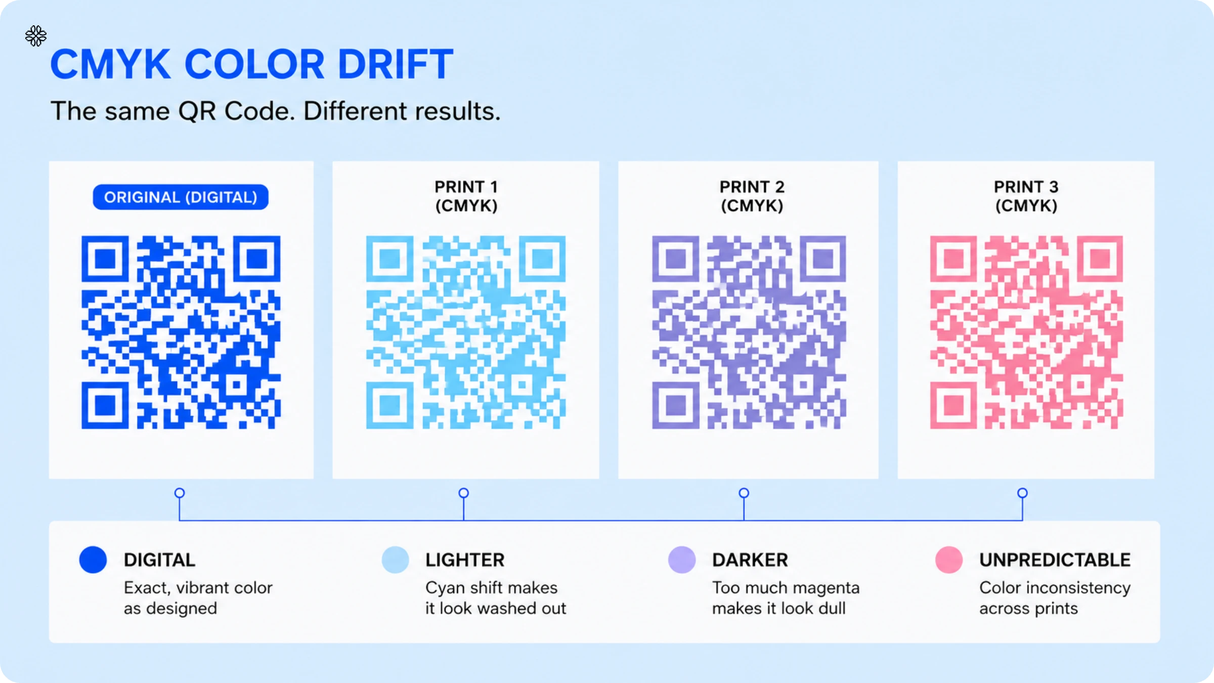
The failure mode most guides skip is CMYK color drift. Screens display color using RGB values, but commercial printers work in CMYK (Cyan, Magenta, Yellow, and Black), and when your design gets converted from one system to the other, the color values shift. That shift is invisible on screen. Your design file looks exactly the same before and after but it shows up on paper. A navy-on-white QR Code that scores 9/10 scannability on your monitor can come out of the printer at 5/10, which is below the threshold for reliable scanning under standard retail lighting. By the time anyone notices, the print run has already shipped.
How to create a colored QR Code in Uniqode (4 steps)
🔔Before you proceed: Every element we’ve mentioned above can be effortlessly transformed by applying tailored colors that enhance and reflect your brand’s identity with Uniqode’s QR Code generator.
Ready to bring your QR Codes to life? Sign up for our 14-day free trial and start customizing today!
Step 1: Log in and start a new QR Code
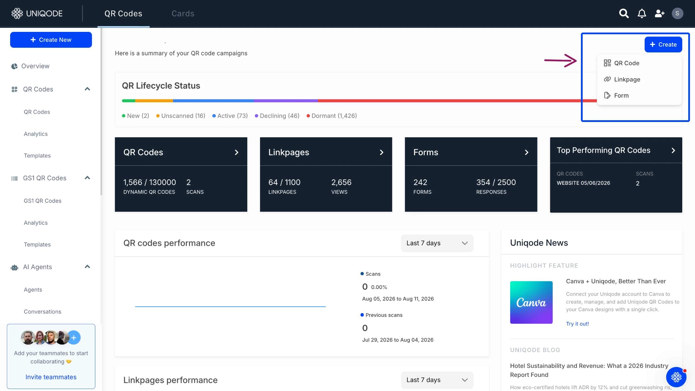
Sign in at dashboard.uniqode.com. Click +Create in the top right and select QR Code. You'll land on the campaign type selector.
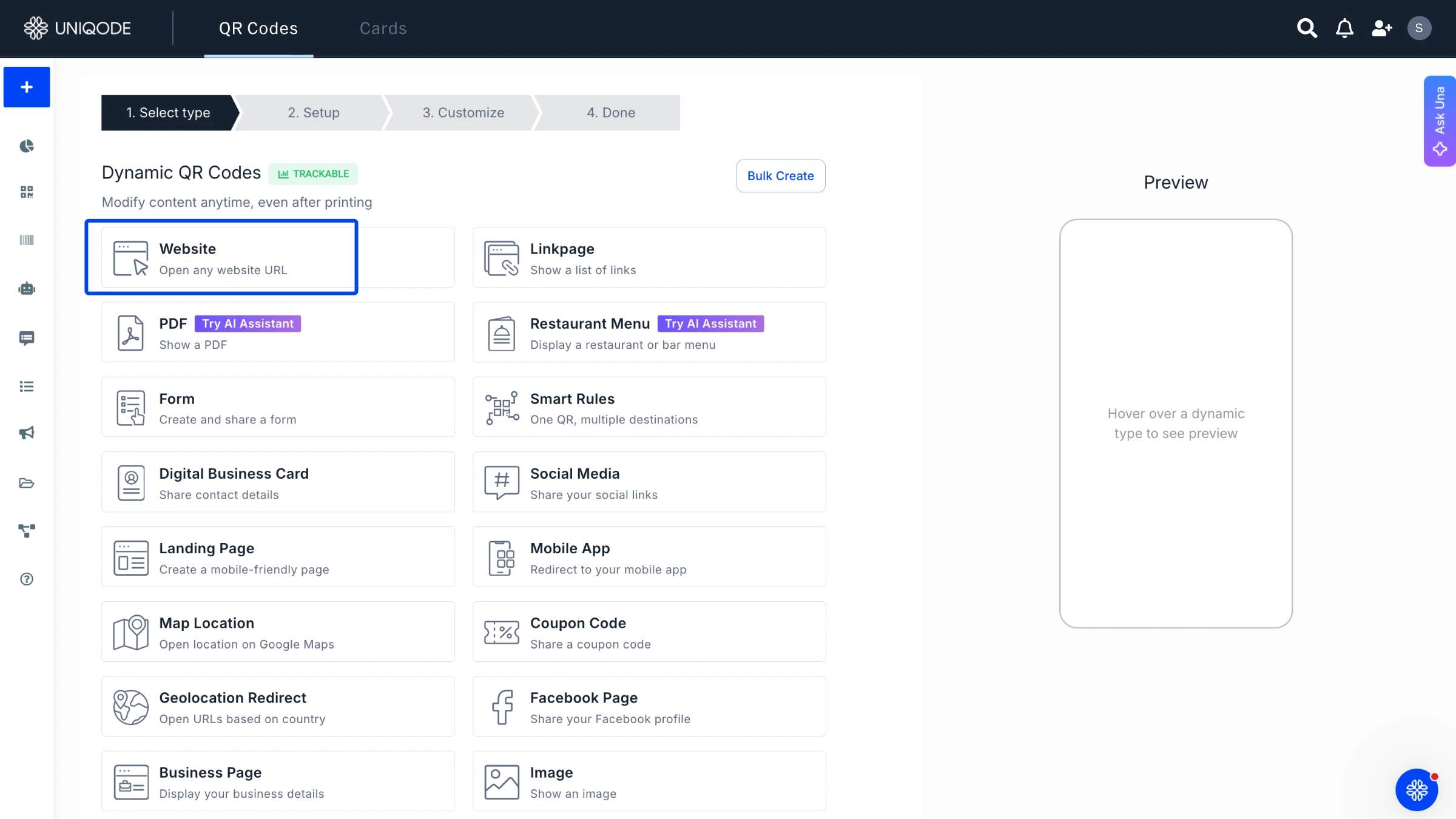
Step 2: Choose your QR Code type and add content
Select your campaign type: Website, PDF, Restaurant Menu, App Download, or any other available type. Enter the destination:
for a Website QR Code →, this is the URL;
for a PDF QR Code →, upload the file.
The type you choose does not affect color customization. Every QR Code type supports full color control across all five elements.
Step 3: Customize your QR Code colors
Each element has its own color control. Enter a hex code for precise brand color matching, or use the color picker.
| Element | What it is | Best practice |
|---|---|---|
| Eyes | The square markers in the three corners | Match the data pattern or use a contrasting accent |
| Data pattern | The dots and squares that hold the encoded data | Use your darkest brand color |
| Background | The field behind the modules | Keep it much lighter than the foreground; white or off-white is safest for print |
| CTA frame | Optional text around the code ("Scan to order," etc.) | Match the foreground color; never match the background |
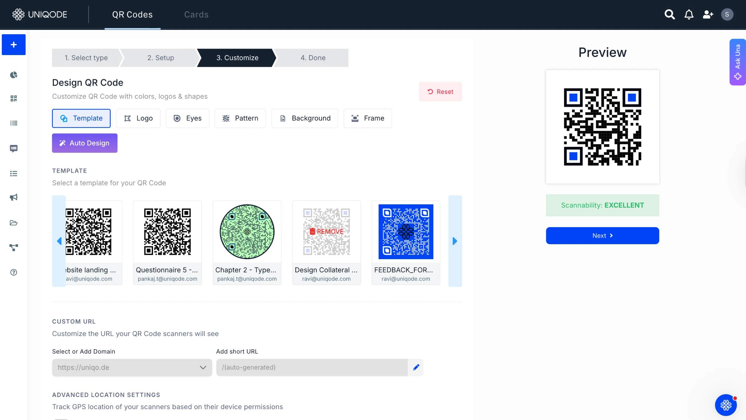
The scannability score updates live as you adjust colors. It's a 1-10 rating of how reliably the code will scan under standard lighting. For print materials, don't download until the score is 7/10 or above. Below that, there's a real chance the code fails under office or retail lighting.
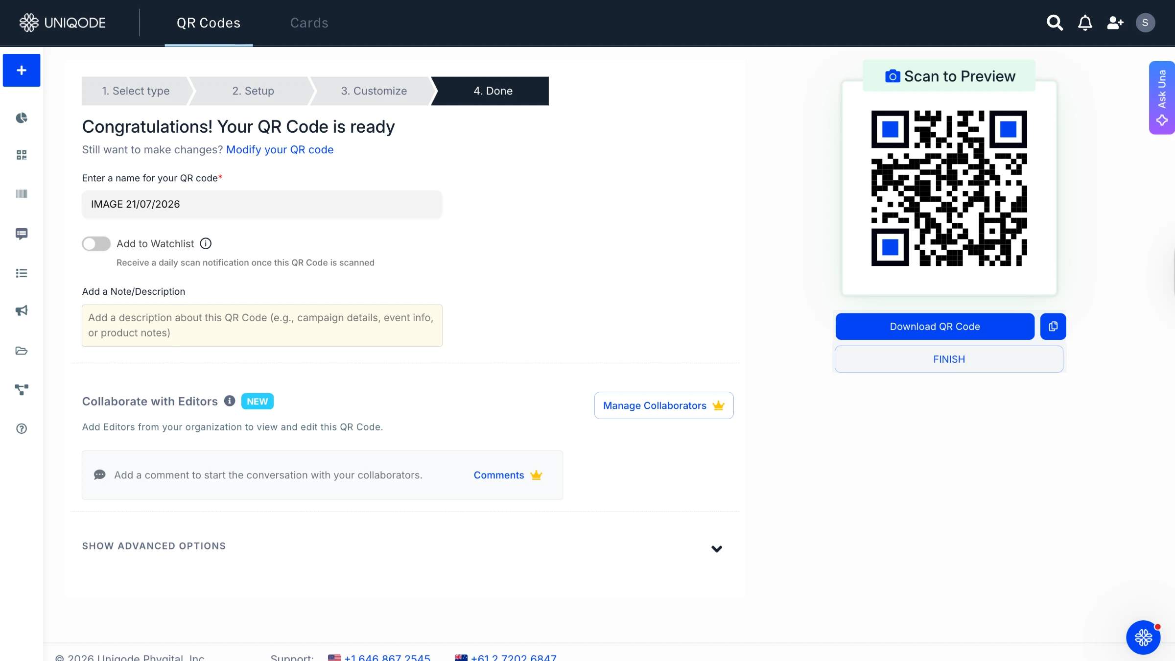
Step 4: Save, download and share your QR Code
Name the QR Code, save it, and open the download panel.
- SVG - use this for print. It keeps exact color values at any size and won't blur or shift when scaled up.
- PNG - use this for digital: email, web, social media.
- PDF and EPS are also available for professional print workflows.
Before closing, save the color setup as a QR Code template. Anyone on your team can apply the same design without rebuilding it, which keeps colors consistent across the whole campaign.
What is Auto Design?
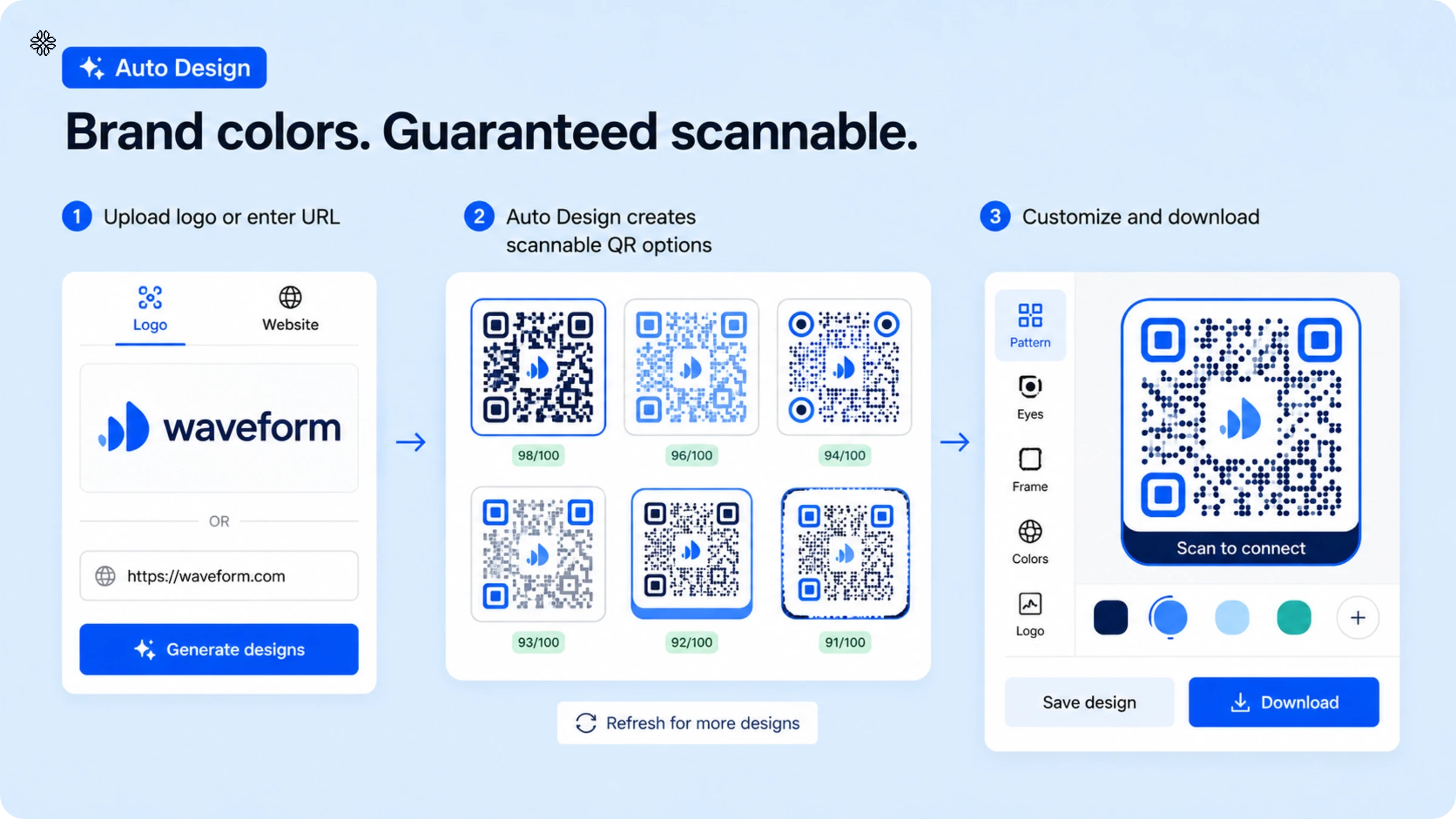
Auto Design is Uniqode's automated color tool for QR Code branding. It removes the manual color-testing loop entirely. Upload your brand logo or enter your website URL, and Auto Design pulls your primary brand colors and builds QR Code designs in those exact colors. Every option it shows you has already been checked against the scannability score and nothing below the contrast threshold gets presented.
This matters especially for print. Auto Design pulls from the actual color values in your logo, which your brand has likely already tested across other printed materials. That gives you a much stronger starting point than picking a shade off a screen and hoping it holds up on paper.
The whole process takes about two minutes. The workflow: upload your logo, pick the option that fits your visual style, and download. If none of the first results feel right, hit refresh and it generates more variations. And if you want to tweak something, just swap a secondary color, adjust the frame and everything Auto Design produces is fully editable in the standard customization panel.
For teams who finish layouts in Canva, the sequence is: build and finalize the QR Code in Uniqode first, then export it as an SVG and import into Canva. Canva integration supports this workflow directly.
How to choose QR Code colors that scan: contrast, accessibility, and CMYK-safe options
QR Code color selection has three technical requirements that must be met before any brand preference applies: sufficient contrast (minimum 3:1 ratio between modules and background), color blindness accessibility, and CMYK-conversion safety for print. Which shades from your palette pass all three determines what is actually usable.
1. Contrast rules: always dark modules on a light background
Dark modules on a light background is the rule, not a preference. QR Code scanners read the pattern by detecting the difference in light reflection between the dark modules and the light background. Flip that (light modules on a dark background) and most phone cameras can't read the code.
The minimum contrast ratio is 3:1. Higher is always safer, especially for print applications where CMYK conversion may slightly shift the rendered tones.
Color combinations that hold up through print conversion:
- Dark navy on white
- Dark teal on white
- Dark burgundy on cream
- Dark green on light yellow
2. Accessibility: avoid red and green as foreground colors
Color vision deficiency affects a significant portion of the population, approximately 300 million people worldwide. The most common form is red-green deficiency. People with this condition see red and green modules as similarly dark tones that may be indistinct from certain backgrounds, even when the general population reads the code as high-contrast. Red and green foreground colors carry accessibility risk regardless of the scannability score.
The test takes 30 seconds: convert your QR Code design to grayscale. If the modules remain clearly darker than the background in grayscale, the code is accessible to most users with color vision deficiency. If the contrast disappears, the code needs a different foreground.
Alternatives to red and green that preserve brand personality while passing the grayscale test: dark navy, dark teal, dark purple, dark burgundy. All express brand character without the accessibility failure mode.
3. Matching your brand palette
Not every shade in a brand palette is suitable as a QR Code foreground. Brand palettes include primary colors, secondary accents, and neutrals. A light accent color fails the 3:1 contrast test against a white background and should not be used as the foreground.
Use the darkest tone from your primary palette for the foreground. For instance, Pepsi's deep navy is the right foreground choice. Their lighter mid-blue, used in other brand contexts, may not meet the contrast minimum.
Color associations by industry can also guide the palette choice, since a code that aligns visually with the expected industry palette reinforces brand legitimacy before the scan:
| Color combination | Association | Typical use case |
|---|---|---|
| Dark navy on white | Trust, reliability | Technology, financial services |
| Deep red on white | Energy, urgency | Food service, fast-moving retail |
| Dark green on white | Natural, sustainable | Consumer goods, wellness |
| Dark teal on white | Modern, precise | Healthcare, technology |
| Dark burgundy on cream | Premium, refined | Luxury goods, hospitality |
If you're unsure which shades from your brand palette pass the contrast threshold, Auto Design selects the right tones automatically from your logo upload.
4. Compatible with Canva or other design tools
If your design workflow includes Canva or another layout tool, follow this sequence: create and color the QR Code in Uniqode first, export in SVG format, then import the SVG into your design tool. SVG preserves exact color values in prepress. A PNG rasterization step can introduce subtle shifts that aren't visible on-screen but affect print output.
Coloring a QR Code inside Canva after export, bypasses Uniqode's scannability validation. For background image and transparent background use cases, apply those settings within Uniqode before the final export.
5. CTA frames and color reinforcement
A call-to-action frame reinforces the color signal and converts passive visual recognition into active engagement. Frame text such as "Scan to order," "Scan for ingredients," or "Scan for your discount" tells the scanner exactly what to expect. Personalized CTAs outperform generic ones in scan-to-action conversion.
For frame design: the frame color should complement the QR Code foreground rather than compete with it. White frames work with any foreground color and keep visual weight on the code. A frame in the same dark color as the foreground creates a unified visual block. Avoid frames that closely match the background color, since this reduces the code's visual weight and makes it easier to overlook.
5 scannability risks with colored QR Codes, and how to fix them
A QR Code that passes design review can still fail in the field. Most colored QR code scan failures occur due to the following five risks:
🚨Risk 1: Low contrast between the modules and background
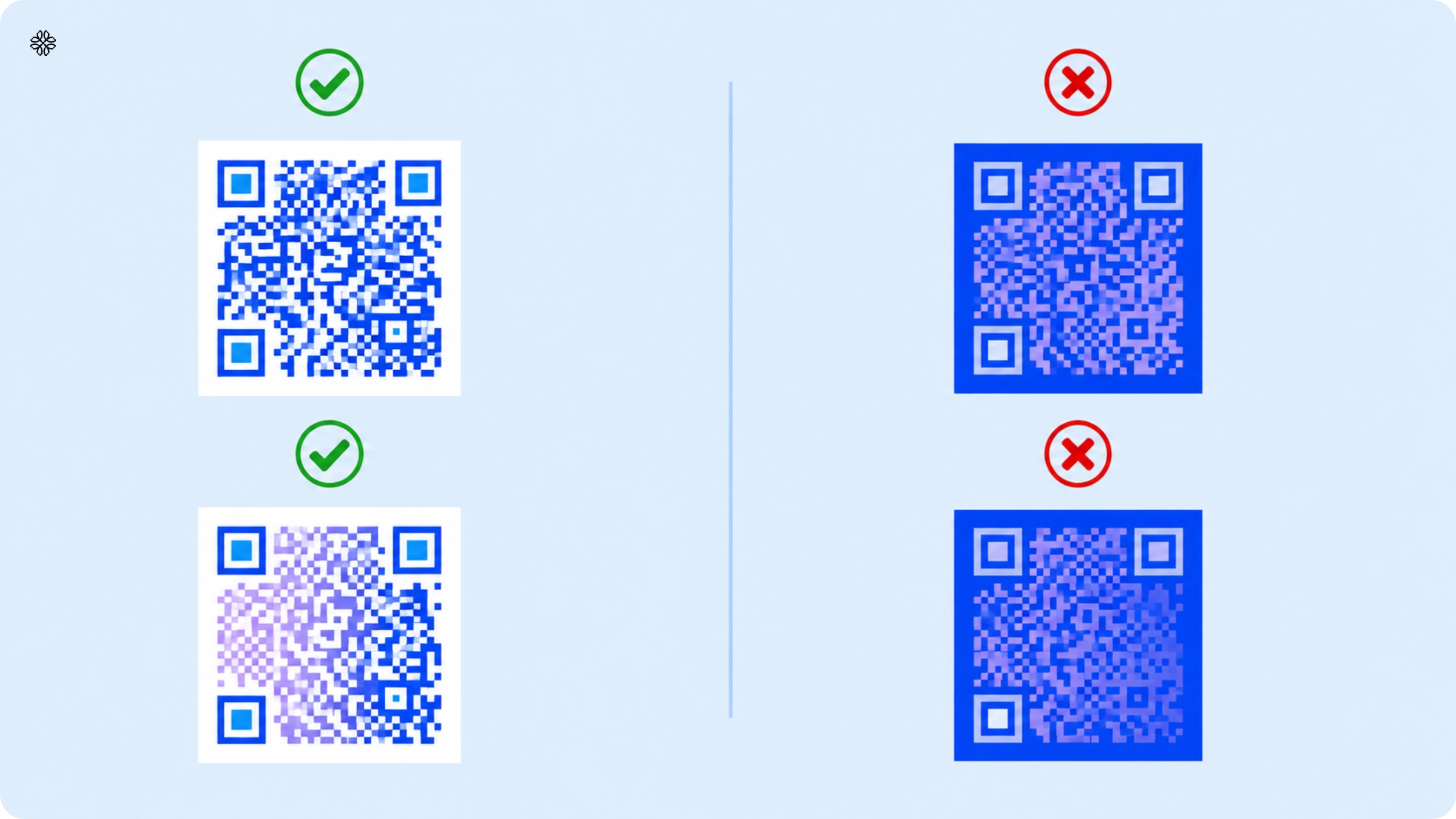
- Data pattern: The modules must appear darker than the background. Light modules on a light background, or an inverted design with light modules on a dark background, will fail on most devices.
- For gradient data patterns:, Ccheck that the gradient's starting color maintains enough darkness to contrast with the background. A light-to-dark gradient works only if the lightest portion of the gradient remains clearly darker than the background field.
Pro tip: Use a tool such as uiGradients to visualize gradients per your brand colors, and use the hex editor on Uniqode to get the exact gradient in a QR Code.
- Eyes: The square position markers in the corners must contrast with the background. If they blend into the background, most mobile cameras cannot accurately locate the code's anchor points.
- Frame: The CTA frame color should differ clearly from the background. When the frame includes text, confirm the text color is legible against the frame itself.
Fix: Use Uniqode's live scannability score during design. Adjust colors until the score reads 7/10 or above for print applications. The score accounts for contrast across all code elements simultaneously.
🚨Risk 2: Dark background colors
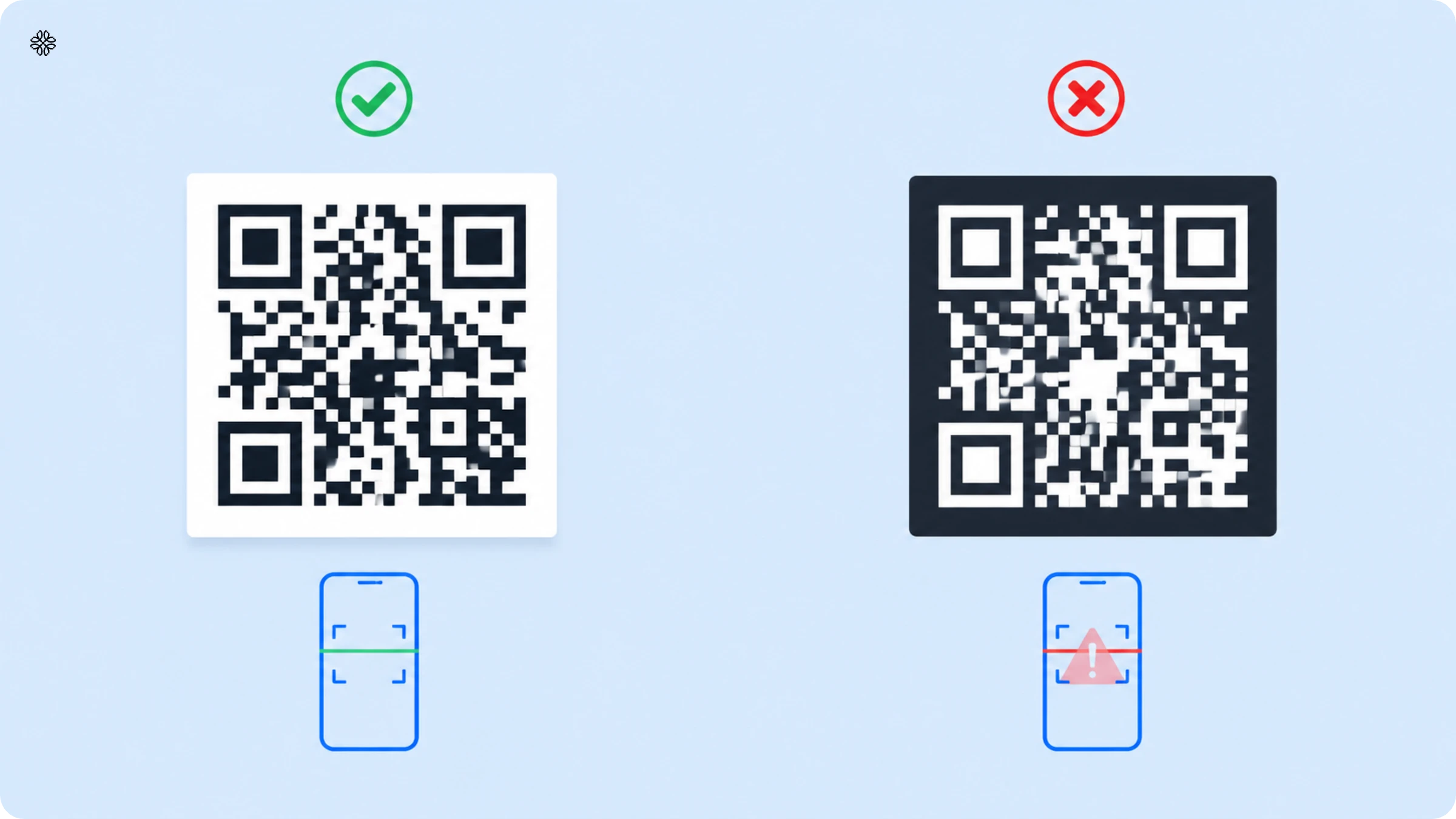
Inverted QR Codes (light modules on a dark background) cause scan failures on most standard camera-based scanners. This applies to transparent QR Codes placed over dark images as well. If the underlying image is dark and the modules are light, the code fails even if it looks fine in the design file.
Fix: Keep the background light and the modules dark. If your design requires a dark surface, place a white or light-colored container behind the QR Code to preserve the contrast relationship between modules and background.
🚨Risk 3: Designing colors in external tools
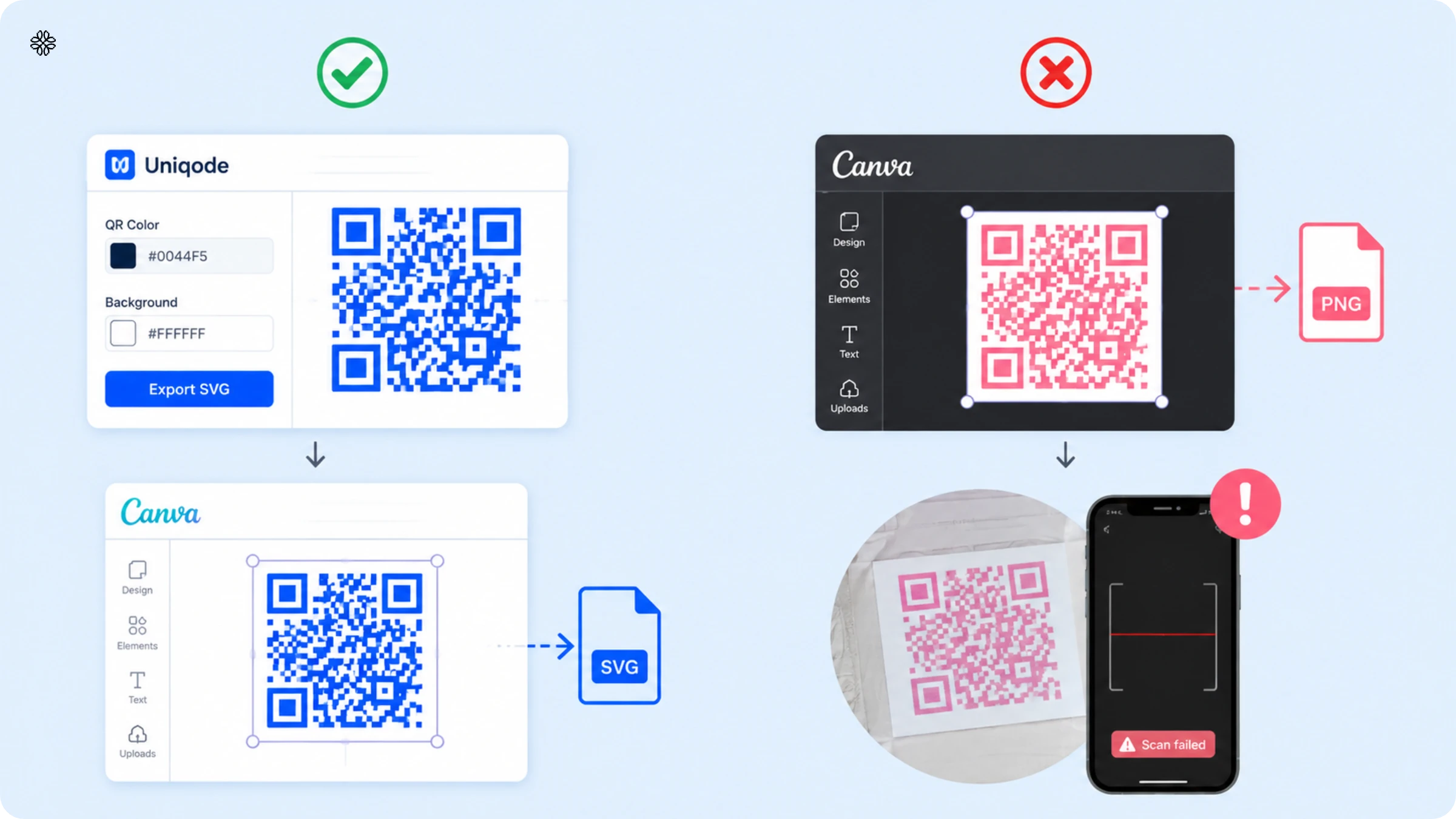
Tools like Canva and Photoshop allow you to recolor QR Code images after export, but they don't validate scannability. Applying color changes to a QR Code outside of a QR Code generator bypasses the contrast validation that confirms the code will scan. While the RGB screen preview looks correct, the CMYK print output may not, because external tools have no knowledge of the CMYK conversion or the minimum contrast threshold.
Fix: Set all QR Code colors inside Uniqode's design panel before exporting. If Canva is part of your layout workflow, export the fully colored QR Code from Uniqode in SVG format first, then import that file into Canva. Do not adjust QR Code colors within Canva after import.
🚨Risk 4: Colors that don't align with your brand identity
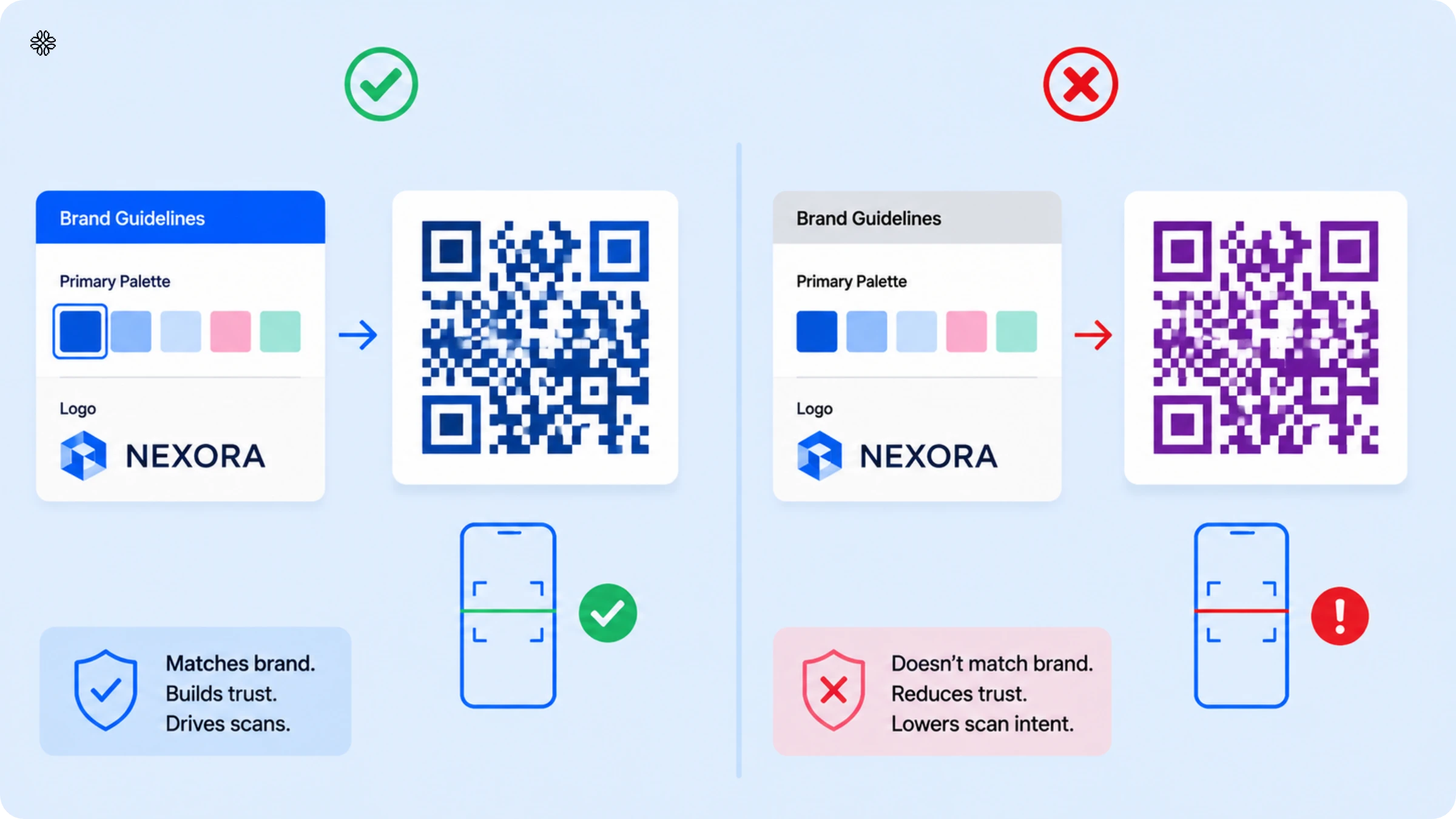
A QR Code in colors that don't match your brand palette reads as a generic code or an unrelated element. It loses the visual trust signal that brand color provides, and that signal is what drives scan intent in the first place.
Fix: Pull colors directly from your official brand guidelines. Use the darkest available tone from your primary palette as the foreground color. If you don't have a defined palette suitable for QR Code use, Auto Design extracts colors from your logo and generates validated options automatically
🚨Risk 5: CMYK print color drift
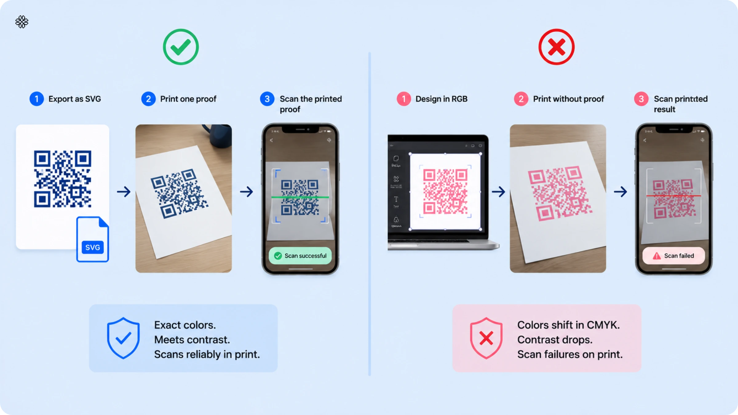
RGB colors used in screen design don't map exactly to CMYK values used in print production. A color that reads as high-contrast on your monitor can shift when the printer renders it in CMYK, producing a softer or differently saturated tone that no longer meets the minimum contrast threshold. This failure appears only on the physical print, not in the design file or the screen preview.
Fix: Three steps before any full print run:
- Export from Uniqode as SVG, not PNG. SVG keeps exact color values and doesn't shift during the print process.
- Print one proof on the actual paper stock at the actual print size.
- Scan the printed proof with your phone from 12 inches away, under normal room lighting. A code that reads 9/10 on screen can read 6/10 on paper. The proof is the only test that matters for print.
Using color psychology to pick the best QR Code color for your brand
One of the best ways to ensure that your QR Code design stands out without clashing with your overall brand identity is to align the QR Code’s colors with your existing color palette. However, suppose you are unsure what color palette to go for. In that case, you can always focus on color psychology to determine the best combination for your brand’s color QR Codes.
Colored QR Codes from real brands, and what made them work
Three publicly documented brand campaigns show what drives scan performance in colored QR Code deployments: McDonald's, Bumble, and La Roche-Posay. Each made a different color decision for a different reason, and each succeeded for a reason that maps back to the contrast and trust principles in this guide.
1. McDonald's #reQRuitement
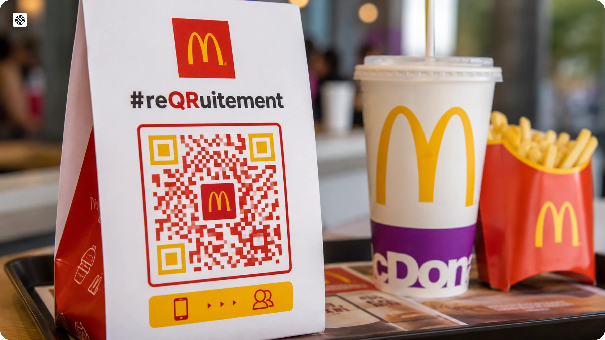
Problem: McDonald's France needed QR Codes on packaging and campaign materials for a recruitment drive, but a generic black-and-white code would have looked disconnected from one of the most recognized brand identities in the world. On materials that already carried the McDonald's visual language, an unbranded code risked being ignored or distrusted.
Solution: McDonald's printed the QR Codes in their signature red and yellow. The color match meant consumers didn't need to evaluate whether the code belonged to McDonald's as the brand colors answered that before anyone raised their phone. The deep red on white also gave the codes strong natural contrast, so they scanned reliably across different lighting conditions and print surfaces.
2. Bumble out-of-home advertising
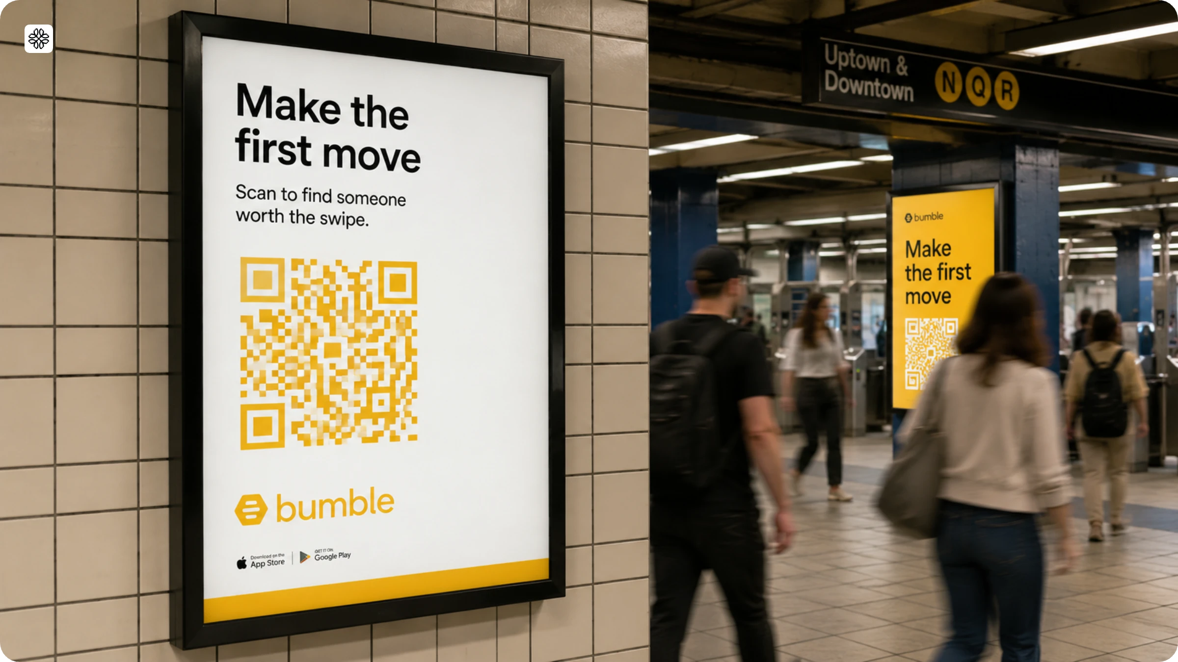
Problem: Out-of-home placements like subway placards and billboards are visually noisy environments. A standard black-and-white QR Code gets lost in that clutter as there's nothing to make it stand out or signal that it's worth scanning.
Solution: Bumble used their brand yellow on every QR Code in the campaign. The color is immediately recognizable, hard to miss, and holds strong contrast against both white and dark backgrounds, which mattered because OOH surfaces vary widely. The brand color did two jobs at once: it stopped people mid-scroll and ensured the code scanned reliably regardless of what it was printed on.
3. La Roche-Posay product packaging
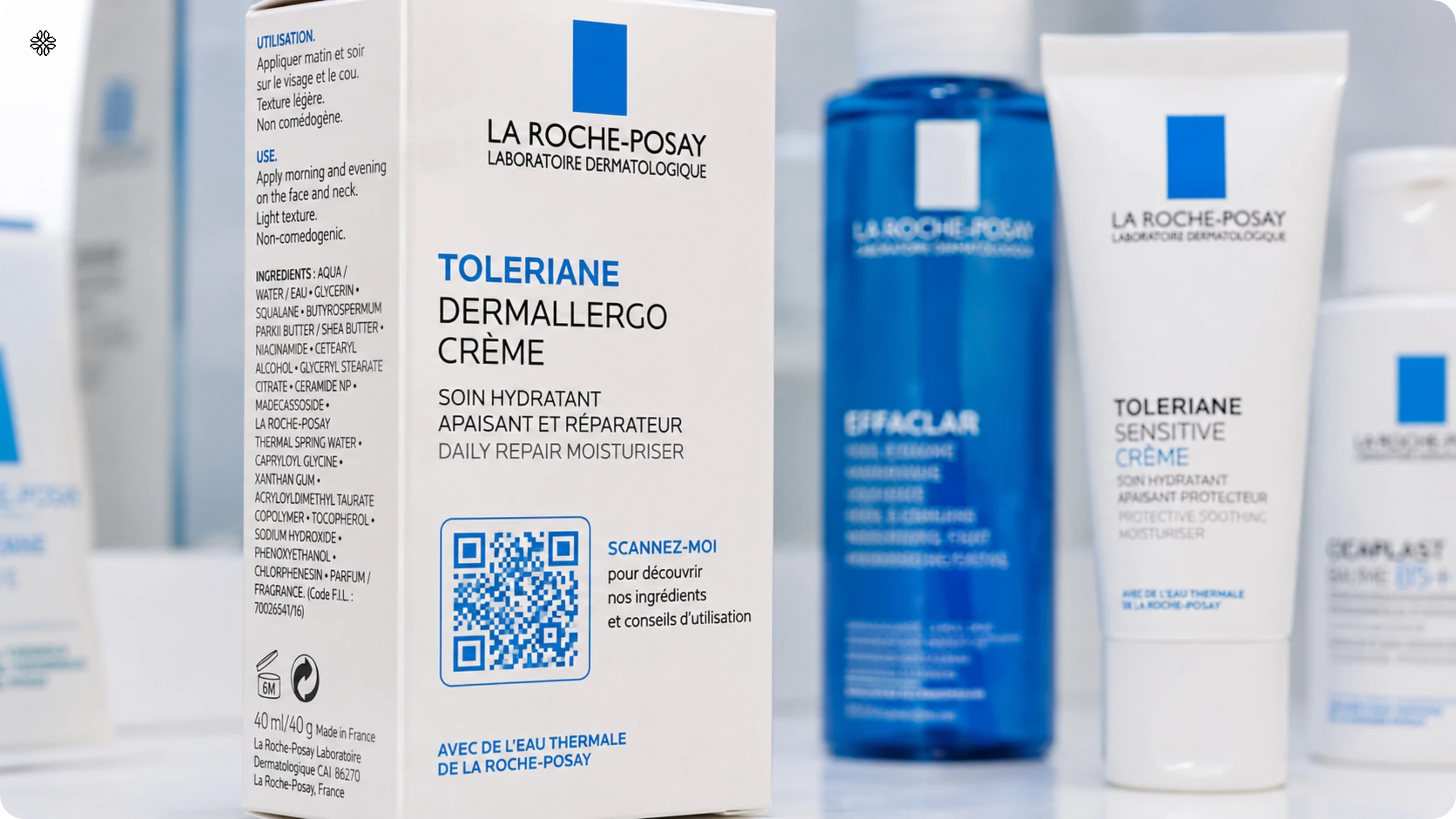
Problem: La Roche-Posay wanted consumers to scan QR Codes on product packaging for full ingredient lists and usage information. But 42% of consumers say a QR Code needs to look legitimate and safe before they'll scan it. A generic black-and-white code on clinical skincare packaging would have looked out of place, and out of place reads as untrustworthy.
Solution: La Roche-Posay used brand-aligned colors on the QR Codes, matching the visual identity of the packaging they appeared on. The result was a code that looked like it was designed to be there, which directly increased scan willingness. The branded design didn't just look better, it removed the hesitation that a mismatched code would have created.
Uniqode vs QR Tiger vs QR Code Generator Pro
Here’s how Uniqode fares against its competitors when it comes to QR Code customization.
| Customization feature | Uniqode | QR Tiger | QR Code Generator Pro |
|---|---|---|---|
| Custom QR Code eyes | ✔️ | ✔️ | ✔️ |
| Custom logo | ✔️ | ✔️ | ✔️ |
| Custom QR Code data patterns | ✔️ | ✔️ | ✔️ |
| Custom background colors | ✔️ | ✔️ | ✔️ |
| Custom CTA frames | ✔️ | ✔️ | ✔️ |
| Custom QR Code templates | ✔️ | ✔️ | ❌ |
| Gradient data patterns | ✔️ | ✔️ | ❌ |
| Logo size edits | ✔️ | ❌ | ❌ |
| Transparent background | ✔️ | ✔️ | ❌ |
| White background for logo | ✔️ | ❌ | ❌ |
| Multiple download formats | ✔️ | ✔️ | ✔️ |
| Image background | ✔️ | ❌ | ❌ |
| Real-time scannability score | ✔️ | ❌ | ❌ |
As you can see from the above comparison, Uniqode is the best QR Code generator among its competitors when it comes to customization.
5 checks before you send a colored QR Code to print
- Scannability score: Is the score 7/10 or higher in Uniqode's design panel? Scores below 7 carry real scan failure risk under standard lighting. Adjust the foreground or background until it passes.
- Grayscale test: Convert the QR Code to grayscale. Can you clearly see the modules against the background? If contrast disappears, the code fails the color blindness accessibility check. Change the foreground color.
- Print proof: Print one copy on the actual paper stock at the actual print size. Scan it from 12 inches away under normal room lighting. This is the only test that confirms whether the color held up through print conversion.
- File format: Did you export SVG for print? SVG keeps exact color values and scales without quality loss. PNG is right for email, web, and social, not print.
- Dynamic QR Code: Is the code dynamic? If the destination URL might change after printing, or if the campaign runs across more than one print cycle, the code must be dynamic. Static QR Codes can't be updated after printing.
Ready to test your brand colors? Uniqode's colored QR Code generator includes the live scannability score and Auto Design, both available on the 14-day free trial.
Frequently Asked Questions
- Why are most QR Codes black and white in color?
The original QR Codes design was influenced by black and white Go board pieces. The reason is high contrast; the bigger the difference between the colors, the easier it is to read the QR Code. Since then, QR Codes have been black and white in color. However, not so recently, the customization of QR Codes grew more popular and became a necessity for businesses.
- Can QR Codes be colorful?
Color can lift the appearance of QR Codes and help attract even more customers. Additionally, you can easily integrate them into your campaigns and marketing collaterals. Create a user-friendly colored QR Code with Uniqode.
- What parts of a QR code can be customized with color?
You can customize five main elements of a QR code with color: the eyes (position markers), the data pattern (dots), the logo or image at the center, the background, and the CTA frame. Each element can be assigned different colors or gradients, allowing you to create a QR code that aligns with your brand identity while maintaining scannability.
- Do colored QR codes scan as reliably as black and white QR codes?
Colored QR codes can scan just as reliably as traditional black and white codes when designed properly. Modern QR code generators like Uniqode provide real-time scannability scores during customization to ensure your color choices don't compromise scan performance. The key is maintaining sufficient contrast between the data pattern and background while avoiding color combinations that reduce readability.
- What is the best QR code generator for creating branded colored QR codes?
Uniqode's QR code generator offers comprehensive color customization with real-time scannability scoring to ensure your branded QR codes remain functional. The platform allows you to customize all five elements—eyes, data pattern, logo, background, and frame—with specific hex codes or color pickers, and includes a 14-day free trial. It also provides live previews so you can see exactly how your color choices affect both appearance and scan performance before downloading.
- Will my colored QR Code look the same in print as it does on my screen?
Not necessarily, and this gap is one of the most common causes of QR Code scan failures in print campaigns. Screen colors use the RGB color space; printers use CMYK. The conversion can shift brand colors enough to reduce the contrast ratio that QR Code scanners require. To prevent print failures: (1) export from Uniqode in SVG format, which preserves exact color values for prepress; (2) print one proof on the actual paper stock before committing to the full run; (3) scan the printed proof with your phone camera to confirm the printed contrast holds. Uniqode's scannability score reflects what the scanner actually sees, not what the screen displays.
- Are colored QR Codes accessible to people with color blindness?
Yes, with the right color choices. Color vision deficiency affects a significant portion of the population. The most common form is red-green deficiency, where red or green modules can appear indistinct from the background to affected users. To verify accessibility: convert your QR Code design to grayscale. If the modules remain clearly darker than the background, the code works for most color-blind users. Dark navy, dark teal, and dark burgundy are accessible alternatives to red and green that maintain brand presence and pass the grayscale test.
- What is the minimum contrast ratio for a colored QR Code to scan reliably?
The minimum contrast ratio between the QR Code modules and the background is 3:1. In practice, higher contrast is always safer, especially for print where the conversion from screen colors to print ink can slightly reduce contrast from what you see on screen. A scannability score of 7/10 or above in Uniqode's design panel is the reliable benchmark for print applications.
- What file format should I download for a colored QR Code used in print?
Always download SVG for print. SVG is a vector format that preserves exact color values during the print production process and scales to any size without losing quality. PNG is the right format for digital channels like email, web, and social media. Downloading a PNG for print and scaling it up is one of the most common causes of color shifts and blurry output in printed QR Codes.
- What colors should I avoid when designing a colored QR Code?
Avoid light or pastel colors as the foreground as they don't create enough contrast against a white or light background to meet the 3:1 minimum. Red and green carry an additional risk: they're the colors most affected by color vision deficiency, meaning a segment of your audience may not be able to scan a code using these as the foreground color. Light yellow, pale pink, and other low-saturation tones as foreground colors are the most common cause of low scannability scores.
- Can I add a logo to a colored QR Code without affecting scannability?
Yes, as long as the logo doesn't cover more than roughly 30% of the QR Code's surface area. QR Codes are built with error correction that allows them to recover data even when part of the pattern is obscured. Keeping the logo to around a quarter of the code's width is the safe limit. Beyond that, the error correction capacity gets used up and the code becomes unreliable. If your design uses both a logo and custom colors, test the scannability score in Uniqode before downloading to confirm the combination still clears the threshold.
- What is Auto Design in Uniqode?
Auto Design is Uniqode's automated color tool for QR Code branding. Upload your brand logo or enter your website URL, and it extracts your primary brand colors and generates QR Code design options in those exact colors. Every option it shows has already been validated against the scannability threshold, so nothing below the contrast minimum gets presented. It removes the manual process of picking hex codes, checking the scannability score, adjusting, and rechecking, the brand color matching and contrast validation happen automatically before you see the results.
About the Author
Ektha is a QR code expert with years of research and analysis into the evolution of QR codes. Having written over 70 in-depth articles on QR technology, she has developed a comprehensive understanding of how QR codes are transforming industries. Her insights, including The State of QR Report, have been featured in leading publications. With a passion for simplifying complex topics and providing actionable strategies, Ektha helps businesses leverage QR codes to enhance their 'phygital' connections.
Related Posts
How to Design a QR Code: Best Practices, Mistakes to Avoid, and Real Examples
High Resolution QR Code : Ensure Clarity and Scannability
Vector QR Codes Explained: SVG vs EPS, DPI, and Print-Ready Setup
QR Code with a Background Image: How to Create One That Still Scans
How to Add a QR Code Border (and Keep It Scannable)