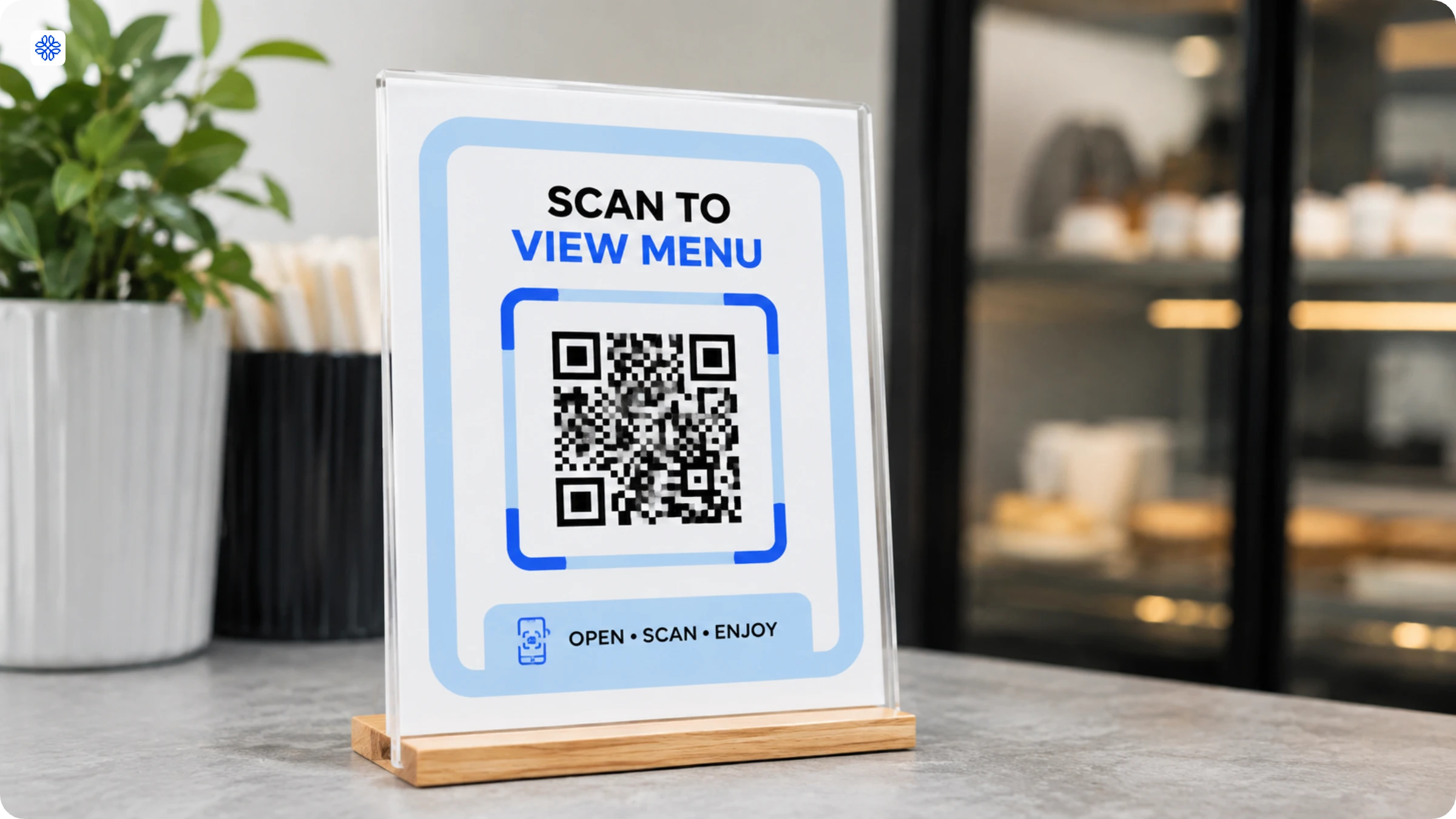
QR Code CTAs: What Top Brands Get Right (Examples and Strategies)
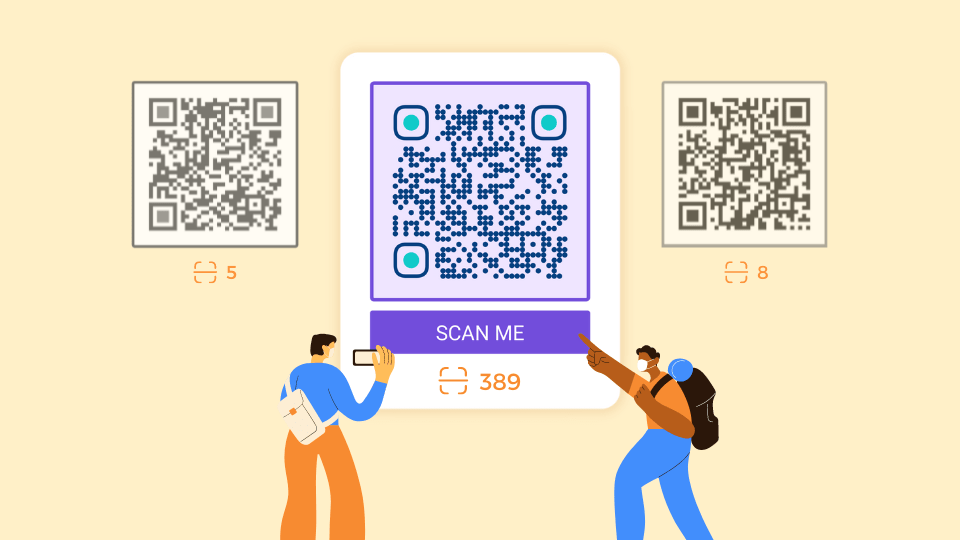
Every marketing material is incomplete without a solid call to action that clicks with your audience. See how Chick-fil-A, Starbucks, and Cadbury have increased customer engagement with QR Code CTAs and how you can emulate their results.
We collected and analyzed 20+ real QR Codes with CTAs from some of the most-recognized consumer brands in the world: Kellogg's, Monster Energy, Chick-fil-A, and others. Several of them are Uniqode customers. We went through each QR Code with a simple question: what made you want to scan it in the first place?
The answer almost always came down to the CTA.
Most brands have sharper copy, smarter placement, and a clearer answer to the question every consumer silently asks before lifting their phone: what's in it for me?
The gap between a QR Code that exists and one that gets scanned is what this article is about. Learn about the patterns behind them, the framework for writing your own, and includes examples by use case.
What is a QR Code call-to-action?
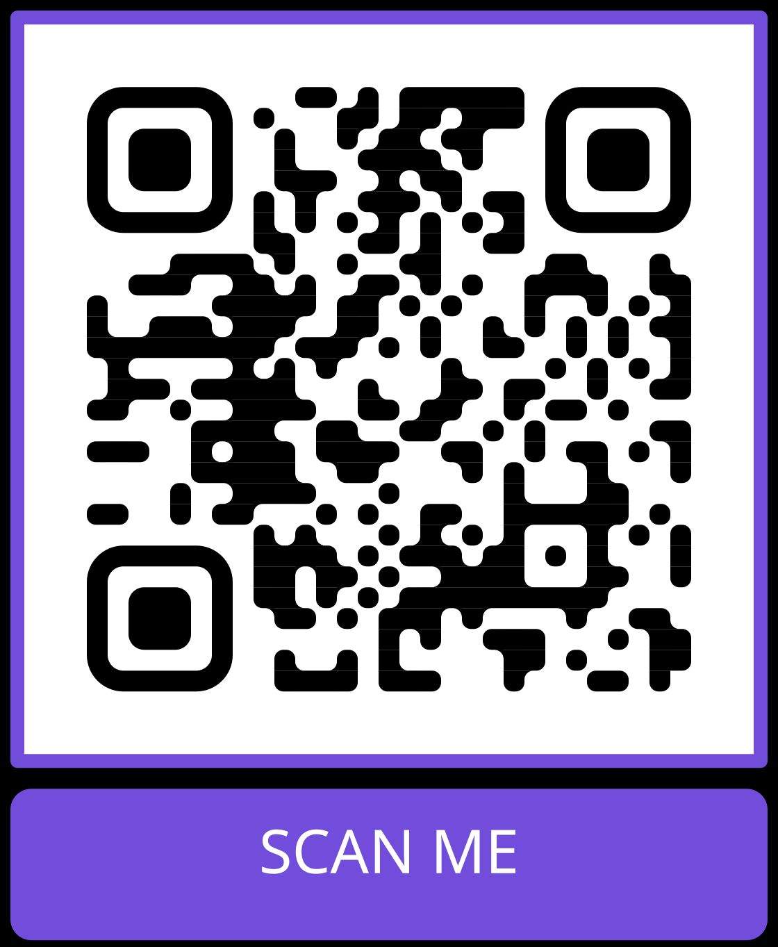
A QR Code call to action (CTA) is the short text framing the QR Code that tells viewers what to do and what they will get. It sits directly above or below the code, inside the QR frame, and runs four to six words: Scan to claim 10% off, Scan for the menu, Scan to RSVP.
Three things get called "text on a QR Code." They are not the same:
- Text inside the QR Code is the encoded payload. The code itself can store plain text, a URL, contact details, Wi-Fi credentials, and so on. If that is what you came here for, the right page is Uniqode's QR Code generator. This article is not about that.
- Frame text is the human-readable copy printed beside the QR Code, the CTA. The scanner never reads this. The reader does.
- Destination page CTA is the button on the page the QR Code sends the user to (Buy now, Claim offer). Independent of the frame text.
Frame text wins or loses the scan. Destination CTA wins or loses the conversion. The two work together but are designed separately.
A clear frame CTA tells the viewer the outcome of the scan before they commit to it. That answers the three questions every scanner asks unconsciously: where will this take me, is it safe, is it worth my time.
Why CTAs on QR Codes matter
A QR Code with no frame text blends into its surroundings. On a busy product label, a crowded event poster, or a retail shelf with dozens of competing visuals, a standalone QR Code is easy to miss entirely. Without one, the viewer has to guess what scanning will do, and most people do not guess. They move on.
The CTA is what flags the code as intentional and worth engaging with. It turns a passive design element into an active invitation. Even a short phrase like "Scan for details" signals that the code leads somewhere useful, which is enough to separate it from the decorative noise around it.
According to a HubSpot study, personalized, specific CTAs convert 202% better than generic defaults. When people know exactly what they will get, they are more likely to act.
QR Code CTAs examples and ideas
We went through 20+ QR Codes created by top brands in the retail, hospitality and events industry. Here are seven QR Code CTAs that stood out and ideas for your next campaign.
1. QR Code CTA for product packaging
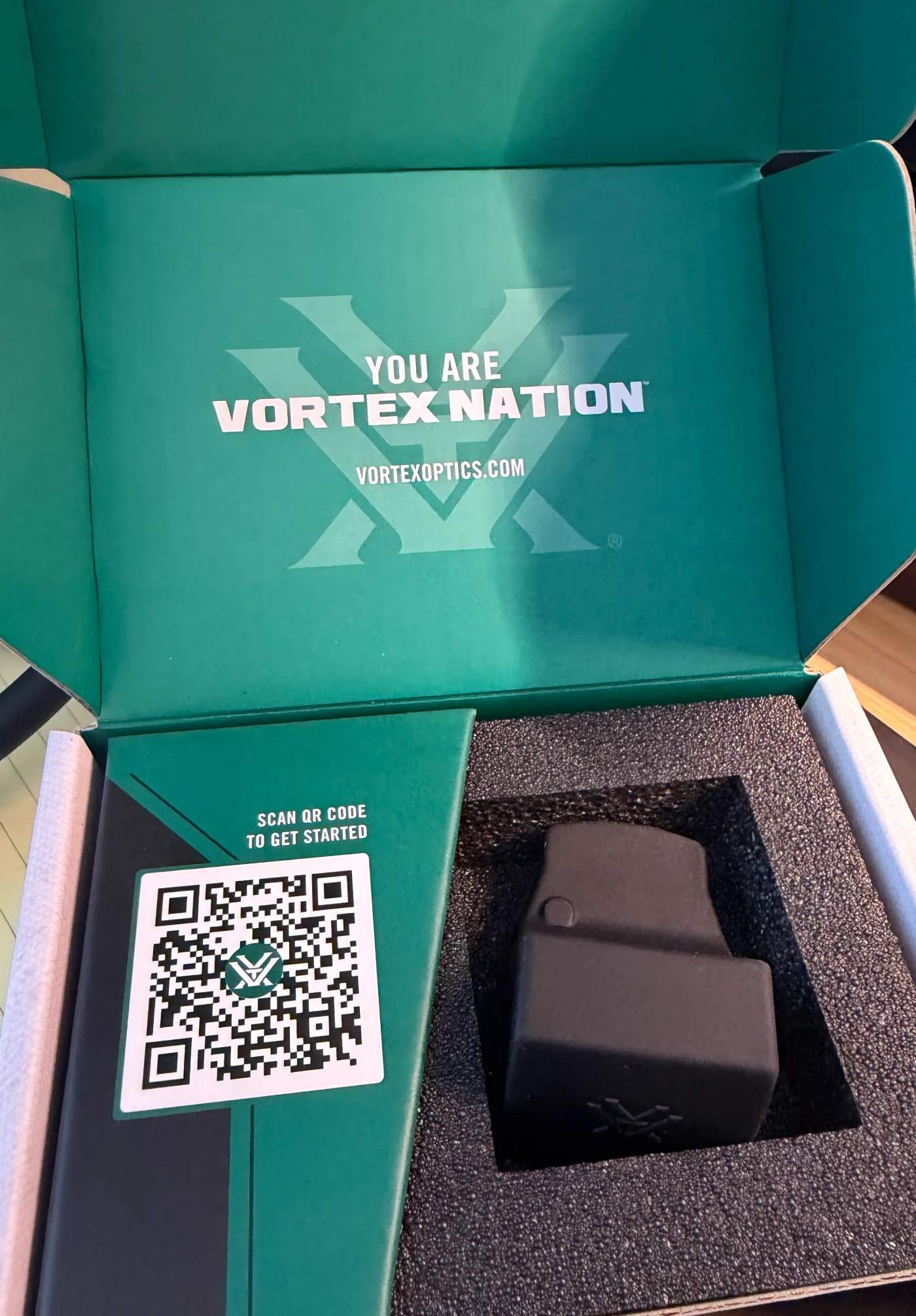
Vortex Optics places "Scan QR Code to Get Started" inside the product box. The timing is deliberate. It targets the unboxing moment when the customer is most engaged and most likely to need setup guidance.
Moi Soi prints "Scan to enjoy Moi Soi's Asian playlist" on its beverage cans. This CTA works because it promises a specific, unexpected reward. The scanner is not being sent to a generic product page. They are getting a curated playlist, which turns a disposable can into a branded content experience.
Ideas: Scan to register your product / Scan for recipes / Scan to verify authenticity / Scan to activate your warranty
2. QR Code CTA for events and conferences
The Sakura event at Gardens by the Bay uses "Buy your tickets here" on a large column wrap. The CTA near the QR Code is effective because it is short, transactional, and placed where the viewer is already interested in attending. There is no persuasion needed, just a clear path to purchase.
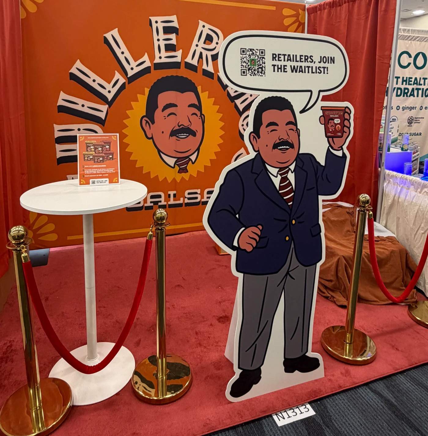
Miller's Salsa uses a life-size character cutout at a trade show with "Retailers, Join the Waitlist!" This CTA filters the audience immediately. Casual browsers ignore it. The target buyer recognizes it as relevant and scans.
Ideas: Scan to RSVP / Scan for the event schedule / Scan to enter the giveaway
3. QR Code CTA for restaurants and food service
Chick-fil-A prints "Watch together on the Chick-fil-A Play App" on drink cups. This CTA succeeds because it names both the destination and the activity. The viewer knows exactly where the scan leads and what they will do there. It also matches the context. Families dining together are the core audience, and "watch together" speaks directly to that moment. The cup itself becomes a medium for engagement rather than disposable packaging.
Ideas: Scan to see today's specials / Scan to order without waiting / Scan to join our rewards program
4. QR Code CTA for retail and in-store
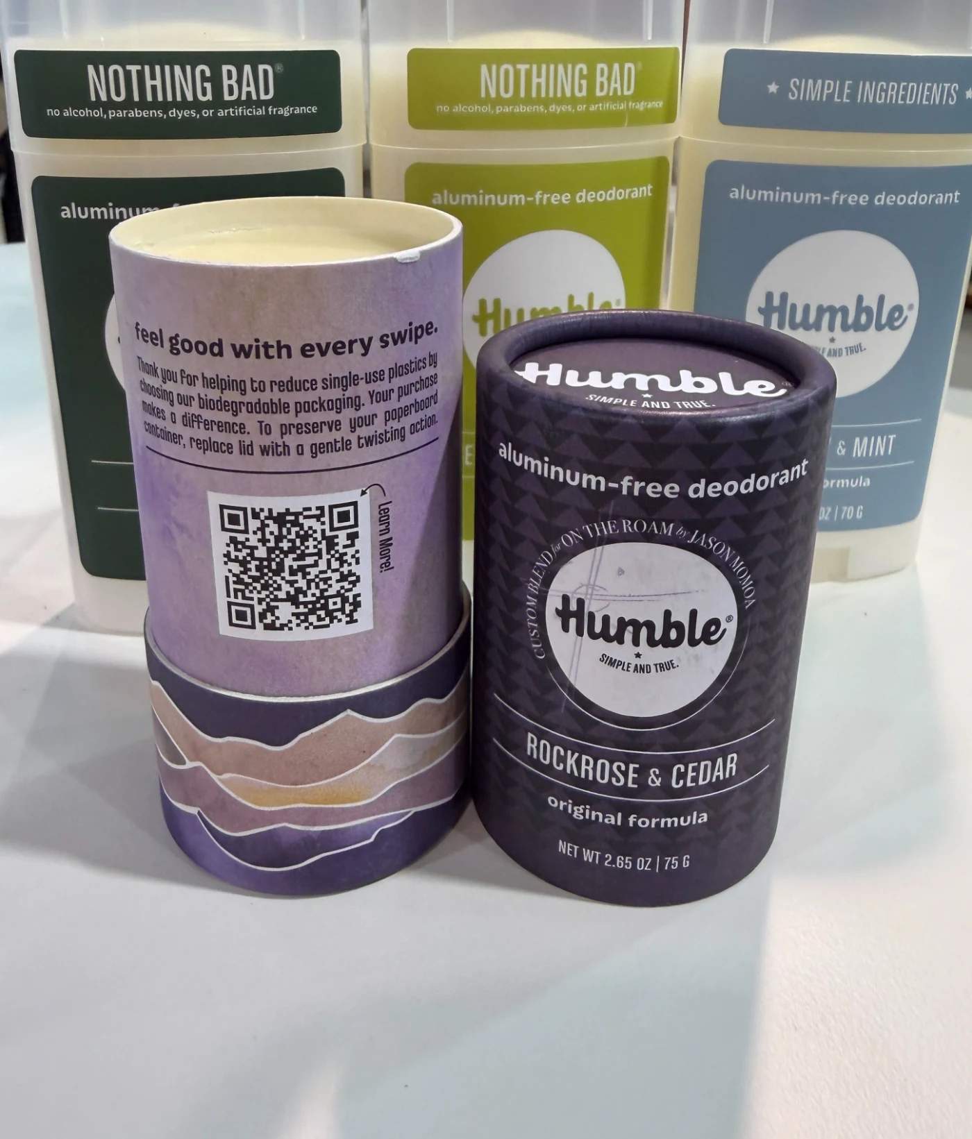
Humble Deodorant prints "Learn More!" beside a QR code on its biodegradable paperboard packaging. The CTA is simple, but its placement does the heavy lifting. It sits next to a message about reducing single-use plastics, so "Learn More" clearly means learning about the brand's sustainability story, not a generic product page. The physical proximity between the CTA and the brand message removes any ambiguity about what the scan will deliver.
Ideas: Scan for honest reviews / Scan to compare models / Scan to check stock near you
5. QR Code CTA for contests and giveaways
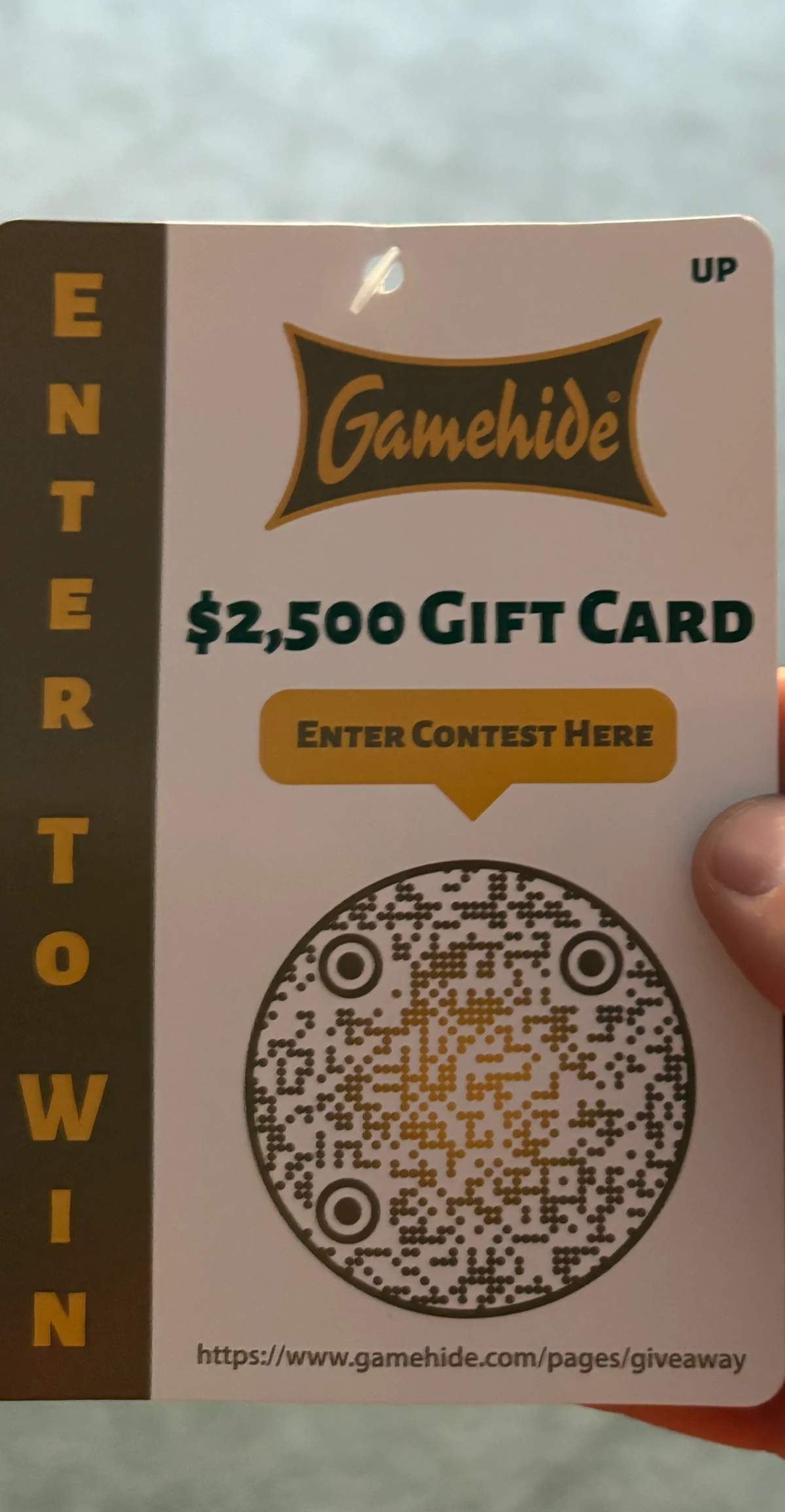
Gamehide's printed card leads with "$2,500 Gift Card" as the headline and "Enter Contest Here" as teh CTA directly above the QR Code. This works because the prize is the CTA. The dollar amount creates instant motivation, and "Enter Contest Here" removes any question about what scanning does.
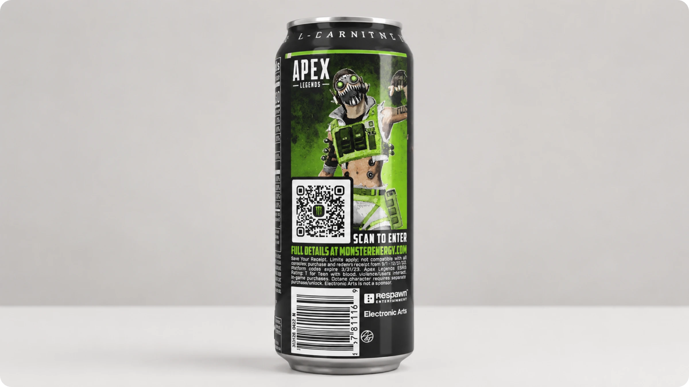
Monster Energy's Apex Legends promotion uses "Scan to Enter" and lists specific in-game rewards like weapon blueprints and operator skins in supporting text. Naming the rewards makes the value concrete rather than abstract.
Ideas: Scan to enter the sweepstakes / Scan to claim your bonus reward / Scan to unlock your code
6. QR Code CTA for entertainment and brand experiences
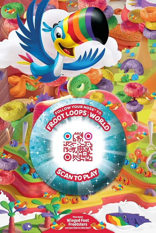
Kellogg's Froot Loops prints "Follow Your Nose to Froot Loops World" with "Scan to Play" on cereal boxes. The CTA works on two levels. "Scan to Play" is the functional instruction. "Follow Your Nose to Froot Loops World" is the emotional hook that frames the scan as the start of an adventure, not a marketing interaction.
Ideas: Scan to play now / Scan to unlock exclusive content / Scan to watch the trailer
Why your QR Code CTA is being ignored
If your scan rate is flat, the problem may be a vague CTA, unreadable text, or low contrast of the modules. Here are the most common reasons QR Code CTAs fail:
- The CTA is too vague. "Scan Here" tells people what to do but not why. Compare it with "Scan to claim your free sample." Specificity creates motivation.
- The frame text is unreadable at the viewing distance. If you sized your QR Codes and the CTAs for the monitor and not for the actual distance the viewer will be standing, chances are your QR Code text is unreadable. A table tent needs frame text at least 4mm tall. A poster seen from three meters needs 12mm or more.
- The CTA and destination do not match. When the frame text promises one thing and the landing page delivers another.
- Low contrast kills legibility. If the frame text does not clear a 4.5:1 contrast ratio against its background, it may as well not exist.
- The code is static and the URL is dead. A static QR Code bakes the URL into the image permanently. If the landing page breaks after print, you will need to reprint. The fix is to use a dynamic QR Code which will let you swap the destination after print.
Patterns from top brands that use CTA QR Codes
We analyzed 20+ QR Code campaigns from top brands across packaging, events, retail, and print advertising. Four patterns consistently appeared in these campaigns.
1. Specificity over cleverness
The best CTAs name exactly what the scan delivers. Kellogg's Froot Loops uses "Scan to Play" alongside "Follow Your Nose to Froot Loops World." Monster Energy prints "Scan to Enter" on cans promoting an Apex Legends gaming promotion. Gamehide's printed card leads with "$2,500 Gift Card" and "Enter Contest Here" directly above the QR code.
None of these are clever or witty. They tell you the reward in plain language. The viewer reads it, understands it, and decides in under two seconds.
Leading with value, not the action
Weak CTAs lead with the action: "Scan this code." Strong CTAs lead with the value. A Benchmade direct mail piece reads "Our Gift to You: Free Lasermarking on Your Purchase" with "Find Your Local Dealer" below the QR Code.
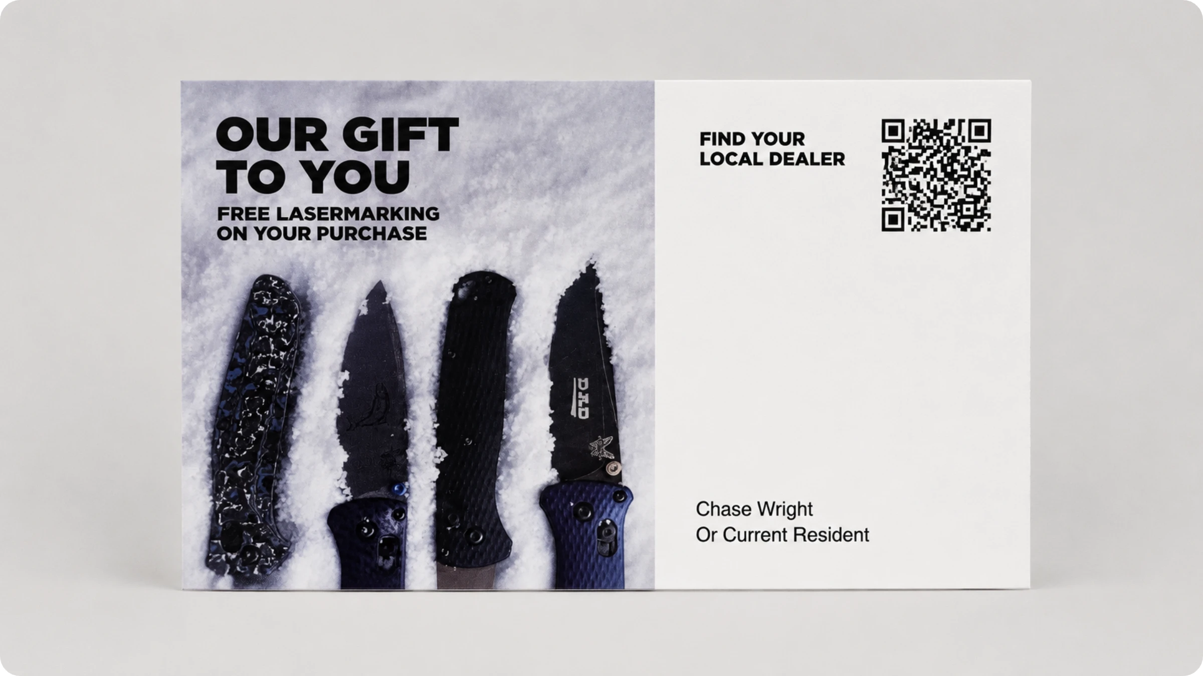
The pattern: the incentive comes first, the verb comes second. People scan codes that promise something, not codes that simply ask for attention.
Matching the CTA to the placement context
On a Chick-fil-A drink cup, the CTA reads "Watch together on the Chick-fil-A Play App." The context is intimate, you are holding the product, so the CTA can be specific.
Compare that with the Sakura event at Gardens by the Bay, Singapore, where a large column wrap reads "Buy your tickets here." The viewer is in motion, so the CTA is short and transactional.
At a trade show, DFA (Dairy Farmers of America) used "Drop Us a Line" above a QR Code with "We'll follow up" below it. The CTA is softer because the context is B2B and the goal is lead capture.
Creating urgency without being pushy
The campaigns that use urgency do it through specifics, not adjectives. Jukebox includes "Hurry, deal ends December 15th" in small print. Monster Energy's cans note "codes expire 3/31/23." The ANA Airlines contest states "Closing date for entry submission is 15 Apr 2026."
A date beats "Limited time!" every time.
How to create an effective QR Code with a call-to-action: A framework
Based on the analysis we did on QR Code CTAs from top brands, let’s look at how you can write CTAs that help you get more scans for your QR Code.
Step 1: Define your goal
Decide what a successful scan looks like before writing a word. An app download, a form submission, a purchase, or a social follow each require a different CTA.
Step 2: Know your placement
A QR Code on packaging is viewed from inches away. One on a billboard is viewed from a moving car. Short CTAs (three to four words) work for large-format placements. Longer CTAs (five to six words) work for close-range materials. Practical formula: minimum frame-text height in mm = scan distance in meters x 4. Always create QR Codes keeping in mind printing guidelines for QR Codes.
Step 3: Match the CTA to your audience
The same QR Code can speak to very different people depending on where it lives.
A retailer at a trade show responds to "Join the Waitlist." A festivalgoer looking at an event poster responds to "Book Now." The same QR Code placement with three different CTAs, each tuned to a different person. The language, tone, and promised value should reflect the mindset of whoever is most likely to scan.
Step 4: Lead with the value
Start with what the scanner gets, not what they need to do. "Exclusive deals" beats "Visit our website." If you can remove the word "scan" and the CTA still works as a standalone value statement, you are on the right track.
4 QR Code CTA strategies to get more engagement
How you present the code, brand it, and maintain the content behind it determines whether that scan turns into a lasting engagement. Here are three strategies to get more out of every QR code CTA.
1. Embed CTAs the right way
Where the CTA sits relative to the QR Code matters as much as what it says. Place the CTA above the code when possible. People read top to bottom, so they process the value before they see the code. This is the pattern most high-performing campaigns follow.
If vertical space is tight, like on a beverage can or a narrow label, wrap the CTA around the code in a frame. On large-format signage, pair the CTA with a directional cue like an arrow or the word "below" so the viewer's eye moves naturally from the text to the code.
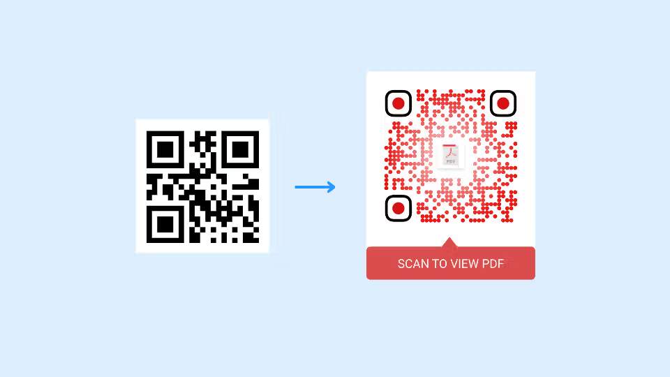
Uniqode lets you add customizable CTA frames directly to your QR codes during creation, so the text stays attached to the code by default rather than relying on a designer to place it manually.
The goal is to make the CTA and the QR Code feel like one unit. When there is too much visual distance between them, the connection breaks. Use QR Code frames to keep the text physically attached to the code. A frame with embedded text like "Scan for 20% off" removes any guesswork about which code to scan and why.
2. Use branded QR Codes
A plain black-and-white QR Code looks generic. It gives the viewer no reason to trust it. Branded QR Codes with your logo in the center, brand colors in the pattern, and a custom frame build recognition and credibility at a glance.
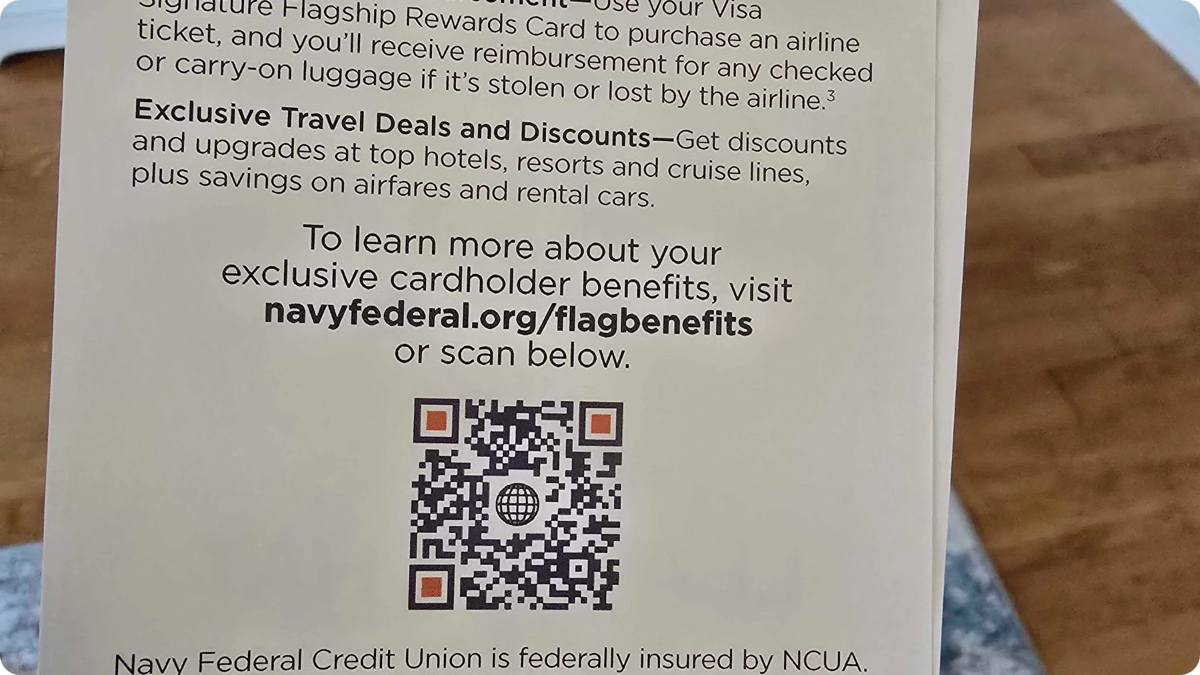
They signal that the code belongs to a real business, not a random link. When the code looks intentional, the CTA next to it carries more weight.
3. Make sure the content behind the QR Code is updated
A strong CTA loses all value if the landing page is broken, outdated, or irrelevant. This is where dynamic QR Codes become essential. Unlike static codes that permanently lock in a URL, dynamic QR Codes use a redirect that you can update anytime without reprinting. Uniqode's dynamic QR Codes let you swap the destination, track scan analytics, and retarget scanners, all from a single dashboard. If a promotion ends or a page moves, you update the link in seconds instead of reprinting thousands of labels.
4. Measure the scan rate
A CTA campaign without measurement is a guess. QR Code analytics give you scans by campaign, by time of day, by location, and by device, dynamic QR analytics give you all four.
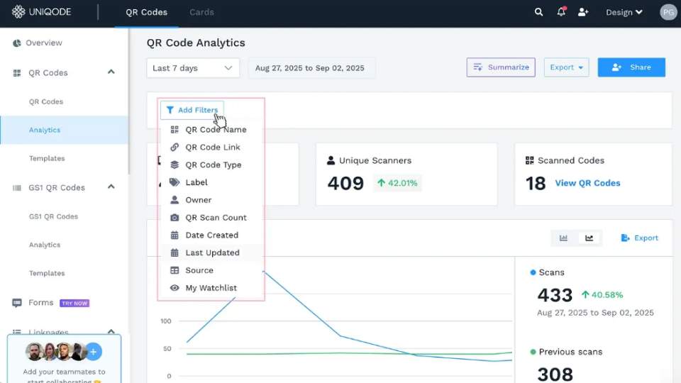
Two specific things to measure: first, baseline a campaign without a CTA frame, then add one. The delta is the value of your CTA. Second, A/B test both the wording and the frame design. Most teams test only the wording, which is how the original table-tent reprint failed.
How to A/B test your QR Code CTA using dynamic QR Codes
A/B testing QR Code CTAs is straightforward with dynamic QR Codes. Unlike static codes that lock in a destination URL, dynamic codes use a redirect you can change without reprinting.
- Create two dynamic QR Codes in your platform (like Uniqode) and point each to a different destination URL.
- Split your print run 50/50 so each version gets equal distribution.
- Add UTM parameters to each URL so you can track performance in your analytics tool.
- Compare scan counts, unique scans, and conversion rates in your QR Code analytics dashboard.
Uniqode's dynamic QR Codes include built-in analytics that track scans by device, location, and time. You can also retarget scanners and update the destination URL at any time, so the winning CTA version scales immediately across your existing print materials. Try Uniqode free for 14 days.
Frequently Asked Questions
- 1. What is a QR code call to action and why is it important?
A QR code call to action (CTA) is text placed near or within a QR code frame that tells users exactly what to expect when they scan it. Tailored CTAs for marketing campaigns convert 202% better than generic ones. CTAs increase scan rates by eliminating guesswork and building trust, addressing common user concerns like safety and relevance before they scan.
- 2. What are the best words to use in a QR code call to action?
Effective QR code CTAs should start with action verbs and be as short as possible while clearly communicating the outcome. Examples include "Scan for 50% discount," "Scan to watch tutorial," or "Scan for exclusive access." Avoid complex words and crowded text, as people's short attention spans mean overly complicated CTAs will be ignored even if they offer excellent outcomes.
- 3. What is the optimal placement for a QR Code call-to-action text?
QR Codes are tools meant to prompt quick actions. So, the closer a CTA text is to its pairing QR Code, the better. Think of them as your physical marketing collaterals’ CTA buttons, albeit initiating a scan instead of a click.
QR Code CTA texts are best fitted inside frames with contrasting backgrounds that increase the CTA’s impact and visibility. If you’re using a custom QR Code generator with text below customization features, you can easily create customizable frames where you can add brief but actionable CTA texts.
You can also generate a QR Code with text in the middle by uploading a CTA image file. Ensure the CTA text is short and contrasts with the QR Code symbols for better visibility.
- 4. How to create a “Scan Me” QR Code frame?
You can create a “Scan me” Call to action QR Code using a trusted QR Code generator such as Uniqode. After choosing your QR Code type, you’ll be given the option to customize your QR Code’s aesthetics. Follow these simple steps once you’re on the customization page:
Click on Frame below the Design section.
You’ll now be presented with a selection of frame designs. Choose the one you want under the Select Frame section.
You can also get any color you want for your frame. Set up RGB or enter the exact color code if you know it.
Lastly, in the Frame Text section, you’ll need to enter the CTA text that you’d like to appear in your codes. You’ll also be able to change your text’s color.
- 6. What is the difference between text inside a QR Code and text below it?
Text inside the QR Code is the encoded data (a URL, plain text, vCard, Wi-Fi credentials). The scanner reads it but the human does not see it. Text below the QR Code is the frame copy, the CTA, that humans read before deciding to scan. The two are independent. Most marketers mean the frame text when they say "text on a QR Code."
- 7. How long can the CTA text on a QR Code be?
Keep the CTA to four to six words for printed materials. The constraint is legibility at scan distance, not character count. The encoded payload inside the QR Code can store thousands of characters, but the visible frame text needs to be readable in a glance.
- 8. Should the CTA go above or below the QR Code?
Below is conventional and tends to perform marginally better because the eye reads top-down on most layouts, the reader sees the QR Code first, then the instruction. Above can work on packaging where the layout reads bottom-up. Test both at the actual viewing distance before committing the print run.
About the Author
Ektha is a QR code expert with years of research and analysis into the evolution of QR codes. Having written over 70 in-depth articles on QR technology, she has developed a comprehensive understanding of how QR codes are transforming industries. Her insights, including The State of QR Report, have been featured in leading publications. With a passion for simplifying complex topics and providing actionable strategies, Ektha helps businesses leverage QR codes to enhance their 'phygital' connections.
Related Posts
How to Design a QR Code: Best Practices, Mistakes to Avoid, and Real Examples
High Resolution QR Code : Ensure Clarity and Scannability
Vector QR Codes Explained: SVG vs EPS, DPI, and Print-Ready Setup
QR Code with a Background Image: How to Create One That Still Scans
How to Add a QR Code Border (and Keep It Scannable)